What is there to not love about pretty much anything My Mind’s Eye? The weight of the paper is fabulous. The texture oh so sublime. The double-sided patterned papers are such good value. The co-ordinating die-cuts, stickers and journaling notes are something I can’t do without. Overall the designs are just to die for. Wouldn’t you agree?
Recently I got to play with some of the MME Quite Contrary ranges … Little Boy Blue and Jack & Jill. It’s hard for me to not wax poetic about these ranges when MME is one of my favourite brands. But honestly they
were fabulous to work with. Initially when mucking about with the Little Boy Blue Curious range I was thrown by the heavy reliance on the reference to owls. I mean haven’t we been there and done that already? But then I thought ‘why fix something that isn’t broken?’. It seems as though owls are going to be with us for perhaps much longer than anyone expected.
I went on to create two LOs with the Little Boy Curious range. Well actually two and a bit but I’ll come to the ‘a bit’ bit later. The first one is of Tan’s DS clowning around one casual day when I was up that way last September. The title may be a bit ‘old hat’ but was so appropriate what else could I use? The second LO features photos Tan took of her DH and DS that same day. I struggled with a title for this one but in the end spoke from my heart and feel it came together nicely. The ‘a bit’ LO combines both the Little Boy Curious range
with the Jack & Jill range. Although one is meant for boys and the other for girls, typically with MME they both compliment each other perfectly. Again, I struggled with a title, but again I spoke from the heart and as a result (as with the LO “What You See”) no journaling was required.
I’d like to share with you the three LOs I created using the MME Quite Contrary range, together with my materials lists and some tips and techniques. I hope they provide you with some inspiration and perhaps even get you using some of the gorgeous My Mind’s Eye papers Tan has in store. Alz :)
Tips/Techniques
Use a palette knife to scrape paint onto cardstock to create a unique background.
Use the pattern in patterned paper to cut an interesting border.
Use Smooch Pearlized Accent Ink to highlight sections in die-cuts.
Adhere die-cuts to JAC paper, cut out and then adhere to chipboard. Once cut out of the chipboard you have a dimensional accent.
Inkssentials Glossy Accents are perfect for highlighting ‘eyes’ on accents/papers.
Materials
MME Quite Contrary Little Boy Blue
* “That’s My Boy” Tree patterned paper
* “When I Grow Up” Owl be There patterned paper
* “Curious” Owl die-cut
* “Little Man” journaling card
* “Curious” journaling card
Bazzill Basics Dotted Swiss cardstock
Paper Raffia – Cocoa
Magic Mesh
Smooch Pearlized Accent Ink - Molasses
Kaiser paint – antique
Inkssentials Glossy Accents
VersaMagic chalk inkpad – Jumbo Java
AC Thickers – Rockabye – Foam – Leaf
AC Thickers – Daydream – Foam – Chestnut
MLS mini alphabet stickers – turquoise
Chocolate Zig Writer
Making Memories staples
Colop date stamp
Chipboard and JAC paper
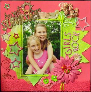
What You See
 Tips/Techniques
Torn patterned paper or cardstock creates both a rustic and relaxed feel.
Alter the colour of fabric by stamping with Tim Holtz Distress Inks and then spraying the fabric with water to help blend the inks.
Using one photo twice can add more emphasis to the central photo.
Using handmade papers as your background instantly adds texture and interest.
Add dimension to die-cuts by (in this instance) scoring the leaves and folding them.
Materials
MME Quite Contrary Little Boy Blue
* “When I Grow Up” Owl be There patterned paper
* “Curious” Who Loves You patterned paper
* “Curious” Accessory Sheets
Green Tara handmade mulberry paper – embossed black (reverse)
Tim Holtz Distress Inks
* Crushed Olive
* Tumbled Glass
* Pumice Stone
Kaiser paints – Seabreeze and Mud Puddle
VersaMagic chalk inkpad – Jumbo Java
AC Thickers – Rockabye – Foam – Leaf
MLS mini alphabet stickers – Turquoise
Sewn fabric strip by Nicole Amber (thanks Nic!)
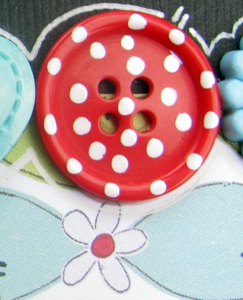
Owl buttons by Kitty Robot
Chocolate Zig Writer
Making Memories staples
Colop date stamp
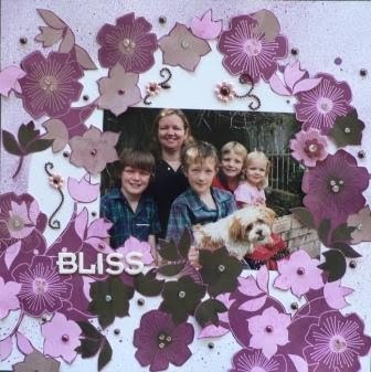
You
 Tips/Techniques
Twice the photo equals twice the fun!
Die-cut small scraps of materials into shapes and set aside for future use … in this instance the red suede dots (leftovers from another project) were the perfect finishing touch.
Take advantage of small tears in handmade, textured paper to create larger tears to have accents ‘peep’ out from.
Incorporating your journaling into your title makes for a clean LO.
‘White space’ (or black as the case may be LOL) draws attention to your photos.
Materials
MME Quite Contrary Little Boy Blue
* “Curious” Who Loves You patterned paper
MME Quite Contrary Jack & Jill
* “Be Happy” Blissful patterned paper
* “Life is Good” Serene Spots patterned paper
Green Tara handmade mulberry paper – embossed black
Sizzix Boss-O alphabet dies
MLS mini alphabet stickers - Gumball
Basic Grey decorative paper clips – Sugar Rush
Jillibean Soup Canvas Flowers – Red Polkas
Prima Embroidered Tabs – Play
Chatterbox Ribbon & Trim – Ruban
Sewn fabric strip by Nicole Amber (thanks Nic!)
Penguin and other polymer clay buttons by Kitty Robot
Various buttons
Felt
Suede
Ink
Colop date stamp
Chipboard and JAC paper