This month we thought we would look at different ideas and ways of ageing.... there is probably many many more than what we have listed below.
Grab a cuppa, sit back and relax and have a wonderful read... you may find something that may inspire you to give it a go. Something you have never tried or done before!
If you do have a go, we would really love to see your work in our
gallery...
http://www.scrapncraftwitht.com.au/gallery
Here are a
list of products you will find in
our shop that you can use for ageing
Distress embossing powders - we have lots of techniques using these if you look under the lable section on the right.
Sandpaper
Distresser Edger
Spray bottle
Scratcher
Scissors
Distressed Inks
Sanding File kit
Hole Reamer
Stazon Ink
Stamps
Masking Tape
Paint
There is probably more I have missed...lol!....
Enjoy!.............luv tanXx
*******************************************************
Here is a step by step by Ingeborg Dijkstra to share with you all....
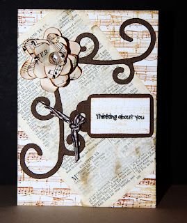
I made this 'vintage style' card using a few aging techniques. The techniques can be used on cards and on layouts. I was inspired by the amazing Tim Holtz, who alters absolutely everything he works with!
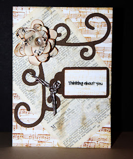
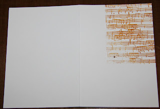
I used
Stazon Ink to stamp the musical notes on the background. Since I know it will be covered, I wasn't too worried about whether the image was stamped perfectly straight.
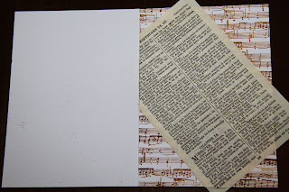
I glued a page of the Bible onto the card. Don't worry, I bought a few old second hand Bibles to do so, I still have my own copy with all the pages! I tore the sides to make it straight again. Again, don't worry about it being 'perfect'; it only adds character if it isn't straight! You can also use an old dictionary or children's book ... anything really.
Using ordinary masking tape I stuck a few strips on top of the page. Make sure the glue has dried, otherwise you might take the whole page of.
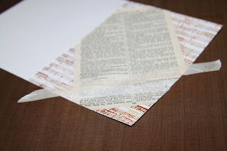
Carefully peel away the masking tape. Some of the glued on page will come off. That's exactly what you want!!
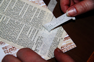
I repeated this a few times in random spots.
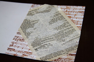
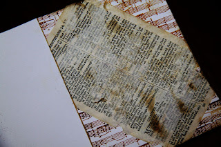
I applied some brown ink over the top to make it look 'old and damaged'.
Using my Sizzix Machine, I cut a few flowers out of some old sheet music papers. Again ... I buy these at second hand stores, cheap and so versatile to use on your projects!
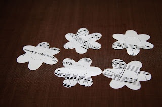
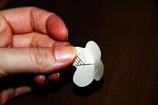
I cut one petal from one of the flowers and two petals from another one.
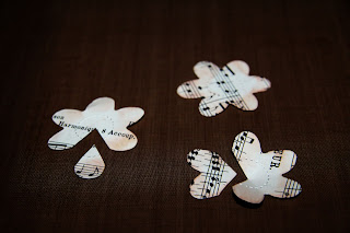
I inked the edges and glued them together.
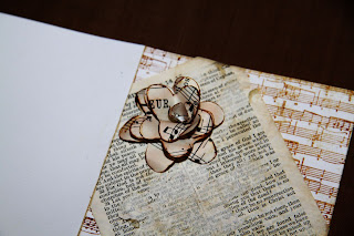
I added the flower to the top left corner of the card.
I added some cardstock swirls and a tag and done!
* * * * * * * * * * * * * * * *
Here are some ideas from Nicky Amber!
Teabag staining
This technique can be used to 'age' your paper or embellishments
and is great if you are looking for a 'vintage' style on your layouts or cards. You don't need to limit this technique to paper either, you can stain lace, flowers, ribbon, raffia, journalling tags.....almost anything.
So how do you do it?? First things first - put the kettle on!!
Make a tea solution and allow to cool (the darkness of the stain will depend on the strength of the tea and how long you leave your items in the solution).
Submerge your items in the tea solution or swipe the damp teabag over the top. You can also squeeze droplets from the damp teabag over the top.
Set your items aside to dry. In the photo below you can see I have stained flowers, embossed card, paper raffia and swiped the edges of a blank card. I then squeezed droplets onto the card. I found the embossed card really took the stain well into the raised parts.
Here are some examples using teabag staining:


***************************************************************************************
Here is some information and ideas from Alison Callcott for you all to enjoy!..
As I sit here pondering the various techniques I use to age and distress materials in my scrapping (I do it on just about every project!) I find it ironic that I’m also trying to remember when my next Botox appointment is!! LOL! Just kidding. ;)
What is it with our (okay my) obsession with making things look older, or shabbier, or distressed? Even on a newborn baby page? I think for me, at least, I love the detail it provides, and the texture and added depth. Plus it’s fun! I also like to savour the moment (so to speak) when creating, and I suppose that ageing and distressing products makes the moment last. Oh and I love getting messy!
So what are my favourite techniques and tools? Well obviously pretty much anything Tim Holtz readily jumps to mind. From distress inks and their re-inkers, to distress embossing powders, and much more. I’ve been distressing products long before Tim Holtz came along though and here are a few of my tried and tested favourite techniques.
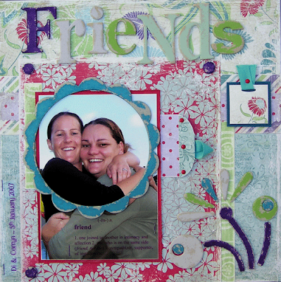
Paint can be used in many ways to age your project and provide great distressing techniques. The LO “Friends” below shows how paint can be sanded back from your product to give a well worn, weathered effect. Its simple … apply paint to your product (in this case my product was various chipboard items), and once thoroughly dry, sand. If you are sanding a lot of painted products you may prefer to do it outside. If not, if you have a drink on your desk I recommend popping something on top of it so you don’t end up drinking ‘paint sand’ and perhaps covering your keyboard and mouse (if its where you scrap) and putting your camera away!
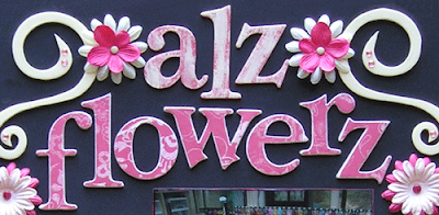
Another way to use
Paint is by dry brushing
Paint onto your product … as shown on the word “alz” in the LO title above. I initially painted the chipboard letters the colour I wanted to show through the dry brushed
Paint and, once dry, using a dry brush, picked up some paint, brushed most of it off on scrap paper, and then painted over the painted alphas. The result is an uneven coat of paint that allows the bottom coat to show through.
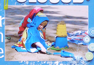
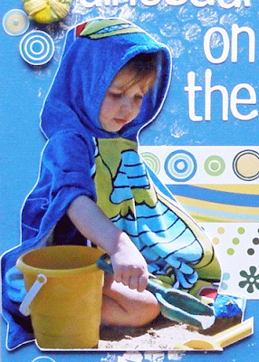
Sanding in some form appears on all of my projects primarily because I rarely matt my photos. To give the edges of my photos some definition I sand them. Okay occasionally I’ll ink them or run paint with my finger down the edges of the photos but more often then not I sand them. The photos below demonstrate how effective sanding the edges of your photos can be. Both photos contain blue as the predominant colour and are also placed on a cardstock of a similar colour. The sanded edge creates a white border around the photo helping them to stand out.
Other ways to effectively use sanding include taking the ‘gloss’ of products that are being used on a vintage style LO where the gloss just doesn’t belong. Also, if you scrunch up your paper and then lay it out flat, the folded creases can be sanded to give an instant distressed look, as in the photo below. When using this technique, depending on the weight of your paper or cardstock, you may need to spray it lightly with a water mister to help soften the fibres to enable it to be scrunched. If this is the case it is important to wait for the paper/cardstock to be completely dry before beginning sanding.
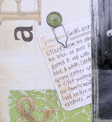
Yet another way to use sanding to great effect is to cover chipboard items (for example) with patterned paper and to sand the edges, not dissimilarly to how we sanded the edges of our photo, or how we sanded the paint off products. See the word “flowerz’ in the photo of the LO title above.
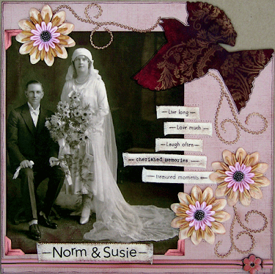
Inking … I am rarely without ink of some sort on my fingers and hands. It’s an occupational hazard I guess! Again, setting the fabulous Tim Holtz Distress Inks aside, I love fluid chalk inkpads. I love that they dry (relatively) quickly, the suede-like texture they create, and their softness on a project. Below is a LO of my grandparents’ wedding “Norm & Susie”.
Apart from the metal brads and the ribbon charm, nothing on this LO, including the photo, escaped my inkpad. Everything from the cardstock to the photo corners, and the twill to the flowers has been inked. Even the ric rac which although initially proved fiddly, was done by placing my inkpad onto a piece of scrap paper and then running the ric rac underneath the inkpad and pulling it out the other side.
Further, I had wanted the photo to have an old feel about it in respect of the type of textures on which photos were printed in the early 1900s. As such I printed the photo out onto cardstock. But it didn’t print true to the colour I was seeing on my computer screen which had not been colour calibrated. So I inked it, being careful to not get any ink on my grandparents.
Yes it may look a little rough in parts but to me that added to the aged look I was trying to achieve. To maintain the same colour tones and hues I used the one inkpad when doing all the inking on this LO.
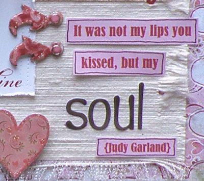
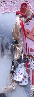
Ribbons and fabrics were made for distressing. Okay amongst other things LOL!! But honestly, how easy is it to fray and ‘rough-house’ twill, fabrics, ribbons and other haberdashery items? Below are three photos where I have … (a) frayed and ripped a heavy raw silk (thanks for the fabric Kylie!!), (b) heavily frayed and ‘pulled at’ the edges of eyelet twill, and (c) torn, shredded and frayed a cluster of ribbons to make a shabby chic accent.
Altering photos with photo editing software to make them appear older, shabbier or entirely different to how they originally appeared is a fantastic way to get started with creating a project featuring ageing and distressing techniques.
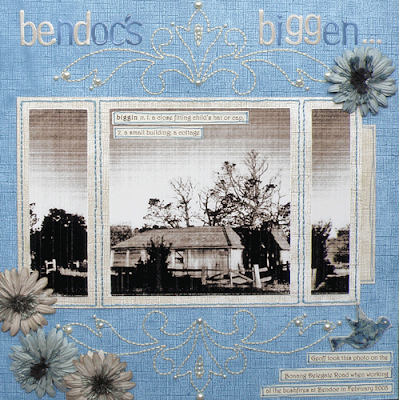
I mean, what better place to start than with your photo? The LO “Bendoc’s Biggen” below (as featured in Scrapbook Creations Issue 72) has been ‘aged’ first by altering the photo. I loved this photo my husband took but honestly, it wasn’t in such great shape for scrapping, well not the way I wanted.
So I literally just played around with it in Photoshop and this was the result. It was perfect for what I had in mind. I also used another technique to ‘age’ my overall LO by creating an image reminiscent of the era of this house … embroidered, perhaps beaded, doilies. Rather than using actual doilies though, I used some Collections chipboard flourishes to draw an outline onto my cardstock.
I pierced holes along my drawn lines and then backstitched the outlined image. Adding pearls as accents I created the type of embellishment on my LO that blends well with the photo but without overpowering it. Neither the embroidery cotton nor the pearls were distressed, but together they combined to create a vintage look.
.jpg)
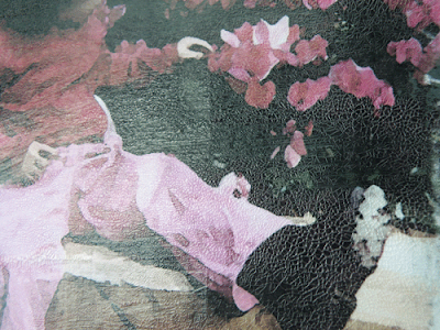
Below is a close up portion of another photo I have edited in Photoshop. This time the photo was from a friend and on receiving it I knew why it was in her ‘too hard basket’! The photo was poorly composed, very, very dark, and my friend’s daughter was barely a speck in the overall frame. We all have photos like this. I still have an enormous pile of them to scrap. But this was for a friend and so I had to tackle it.
Again, playing in Photoshop and admittedly using the ‘undo’ option a number of times I eventually found myself with this image reminiscent (to me) of the 19th century Impressionist art movement in Paris. I liked it and I was immediately inspired to work with it. As I was now scrapping the photo more like a mini painting than an actual photo, I printed it on cardstock. To assist with ageing the printed photo to something possibly dating back as far as the 19th century I roughly sanded the ink from the printed image in various places as though to represent damage from over the years.
Finally, because my printed image was a flat colour without any brushstrokes or apparent glazed finish, I used a DecoArt crackle medium, which I brushed onto the print in varying directions and set aside to dry. As it dried, the crackle medium provided a lovely soft crackle glaze effect and my image was complete.
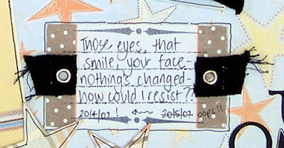
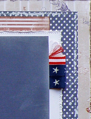
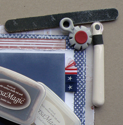
Finally, combining multiple distressing/ageing techniques can be very effective as one effect supports the other. Below is a section of a LO I completed today for a girlfriend, together with a photo of the same section with my ‘staple’ distressing/ageing tools.
In the image of the LO I have … (a) used a Tim Holtz distress tool to roughen the edges of my 12x12 patterned paper which I have then inked, (b) sanded the polka dot paper by placing it on the edge of my craft desk when sanding to create a sanded ‘ridge’, (c) heavily and unevenly inked the edges of the striped paper, (d) on the white cardstock used the Tim Holtz distress tool to roughen the edges and then used a quilting tool to create evenly spaced sewing holes (but with no cotton as though the cotton has long since gone), (e) inked the dark coloured photo matt with a white fluid chalk inkpad to create a faded and worn look, and finally, (f) frayed the edges of the red and white ribbon. All of those effects (as shown in just a small square of the LO) work together to create an overall shabby feel whereas one alone may not have worked so successfully.
As you can see from the photo above, I have only a handful of tools I prefer to use when distressing or ageing products or projects: a sanding board, my Tim Holtz edge distresser, a quilting/sewing tool, and inkpads (in this case fluid chalk inkpads).
I’ve enjoyed sharing these techniques with you and look forward to you sharing your favourite techniques with me. Alz :)
************************************************************************
Here is what Leanne Stamatellos said about ageing...
Oh I absolutely love the look of ageing on a layout but to be honest, I don't really do it on mine. My style is crisp and sharp and clean in the colours ... most times, and so it probably doesn't lend itself to this look, but boy are there some amazing scrappers out there that do it so well
**********************************************************************
Some ideas from Kylie Abel...
I tend to like to keep things relatively simple. The less specific tools required, the better for me!
My favourite method for ageing is the simple "rip and ink" method. All that is required is your hands and a small ink pad. I love using my versacolor "pinecone" ink for ageing, but you can use different colours for different effects.
At it's simplest - all you need to do is rip the edges of your paper and softly run the inkpad over the exposed areas. The ripped edge will soak up more ink, leaving a nice darkened edge...

If you want to be a little more adventurous, you can rough everything up by scrunching it tightly up and ripping small bits of the edges before running the inkpad lightly over everything. I love this technique because it doesn't matter about being precise or neat!

I also love ripping and inking different types of papers and cardboards too. The result can be fery different base on what paper/card you're using. Here I have used a pizza box as the base for my LO and have ripped bits off, exposing the inner core. Very effective!

***************************************************
Here is some Ideas from Tanyah Payne to share...
Stamping and inking your flowers and edges of your paper
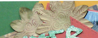
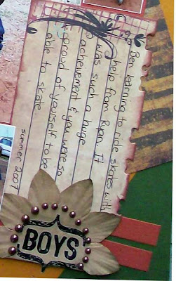
Using Distressed embossing powerders...
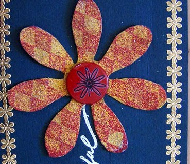
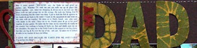
Distress using Alchol ink are fantastic for they can be used on any porous surfaces. I have used gel medium and mixed some clear medium beads.Then i painted the alchole inks over the top.... Adding the gold/silver/pearl/copper metallic alcohole inks can add more ageing affects.
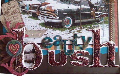
Using Crayons
This is a really fun technique where you iron crayons onto your surface of your paper and then i have die cut out shapes out of the paper.
I have also used alchole inks over the top of baby wipes and covered my little mini album...
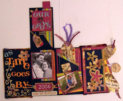
Using Pearl powders
This can be fun using with gel medim and adding bumping textures
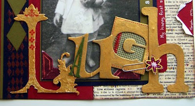
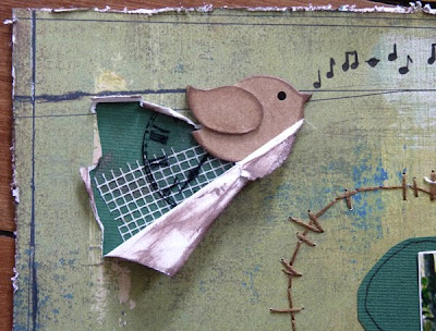
Tearing paper can be really cool and lots of fun, this can be done with tearing or curling the edges.
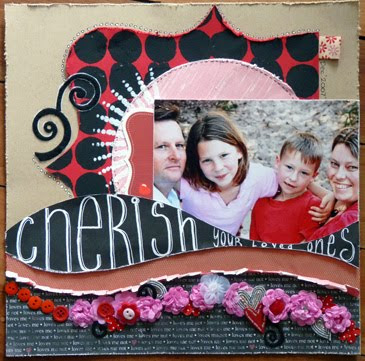
Their is lots of ways of using paint that can make something look ages too, i have used a ruler for this one
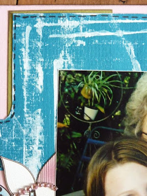
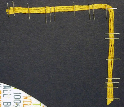
here i have used staples, their is lots of ways of using staples to create an aged look.
Thanks for looking
luv tanXx
**********************************************************
Here are a few of Tracey's favourite techniques -
Ageing is such a fun process and like the other design team members I love to use the many techniques that are on offer to age a project. I love the whole sanding technique along with scrunching and inking my printed papers. Dyeing paper is so much fun also… and using a batik method within the dyeing process lends itself to some really awesome looks. One of my favourite things to do are to pull out my Tim Holtz inks.
On the project I have featured I have used paints firstly as my base and then added both the Adirondack Alcohol Inks and Tim Holtz Distress Inks. The many colors that are available are stunning. There are so many ways to incorporate them into your work too. They can be used on many surfaces to achieve varying looks – especially when you combine them with the Adirondack blending solution.
**********************************************************************************
These techniques don't suit everyones styles and so it isn't for everyone.
There is probably a lot more ideas than this but I am sure you will love and enjoy these few and feel inspired.
We would love to hear what you have to say or think about these techniques. If you have tried them and ifyou enjoyed the whole process.
PLEASE SHARE YOUR WORK WITH US IN OUR GALLERY... we enjoy seeing your amazing work and would love for you to place it in their....,
http://www.scrapncraftwitht.com.au/gallery
Thank you to my very creative, tallanted design team who have helped to put this together, I very much appreciate all your hard work
till next time
luv tanXx








.jpg)


