I have a new blog!

If you want to see only my creations please come and check out and follow my new blog http://www.tanyah-payne.blogspot.com

Friday, June 4, 2010

'Scrapping on a budget' layout by Ingeborg Dijkstra


A couple of weeks ago I created a layout for less than $ 1.00 and I have had so many wonderful responses that I thought I'd do it again! This layout was made using one sheet of cardstock and a piece of Prima packaging and other stuff I had in my stash. I do love buying new products, but with this layout I want to show you that you can still make a funky, colourful and balanced layout without spending too much!

List of materials I used:

I started by distressing a sheet of slightly textured pink cardstock. Using a ruler and pencil, I marked a square on my layout (about an 1.5 inch / 4 cm from the border, see picture 1). I used die cut letters for my title. If you don't have a die cut machine, you can also use a chipboard alphabet (or whatever you have left). I placed my title on the left (see picture 2 and 3).

I removed the die cut letters and traced the pencil lines with a black marker. I wanted to make the letters stand out, so I stamped dots on them. I cannot remember the brand name of the dotted stamp, sorry.

I used the 'negatives' from the die cuts to define the area I wanted to stamp. I used them like a mask or stencil (see pictures below). If you want to skip this step, you can also choose to doodle in your letters ...
I have a package of 'Say It In Crystal Flourishes' by Prima. These bling flourishes are gorgeous, but I didn't want to use them, since I wanted to make this a BUDGET layout. So ... I opened the package and carefully cut out one of the swirls. Using my scanner (see pictures below) I printed the swirl. I put the cardstock on top of the printed swirl (yes, I held it against the window when the sun was shining to create my FREE light box ) and used my black marker to make 'dots' following the printed shape. I still have the original bling flourish to use on another layout!

Whilst opening the package of bling swirls, I couldn't help but noticing the super cute black and white dots. So ... I used the packaging instead of patterned paper. You can see the barcode on the picture below. I chose to cover the barcode and product name with ribbon and a picture, but it is quite funky to even have that shown on your layout too!

I went through my stash to find a matching piece of ribbon. I also had some leftover paper from the Bella Grace collection. I used the black and white paper to cut out three flowers.
I added some lime flowers from my stash and punched three little white flowers and finished off with a pink rhinestone in the middle of each flower. Done!

Thursday, June 3, 2010

Fancy Pants - Rusted Sun Paper Collection, Layout by Sarah Rickard

Just check out the new Rusted Sun Collection from Fancy Pants!  It is nice, bright, funky and just gorgeous! 

It is such a versatile range.

Here is the layout that I have done using some of the papers.


The products I have used for this layout are:-

*  cardstock, fabric, machine sewing, staples

I would love to see your layouts in the gallery.

Happy scrapping,

Sarah xoxo

Wednesday, June 2, 2010

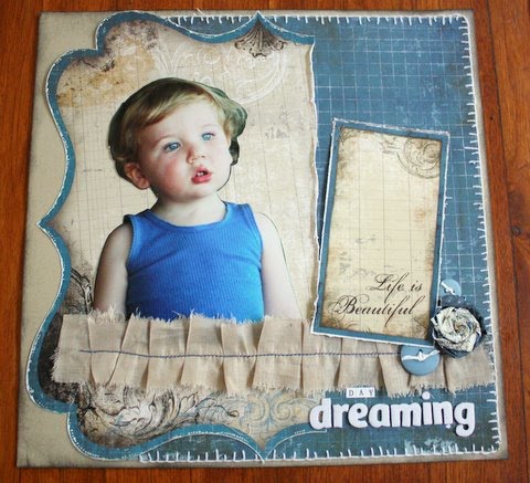
"Day dreaming" Step by step and handmade flower by Nicky Amber

I have used the Bo Bunny 'Mama Razzi' range for this step by step.  I've found this range is really versatile. The obvious themes include photography, male, vintage, heritage, graduation but can be used for many more...

Materials used:
               -  Mama Razzi Cut-outs            
               -  Mama Razzi Shutter
               -  Panorami die cut
               -  Mama Razzi Tabloid                             

Step 1.  I used the kraft cardstock as a base and inked around the edges with black ink.


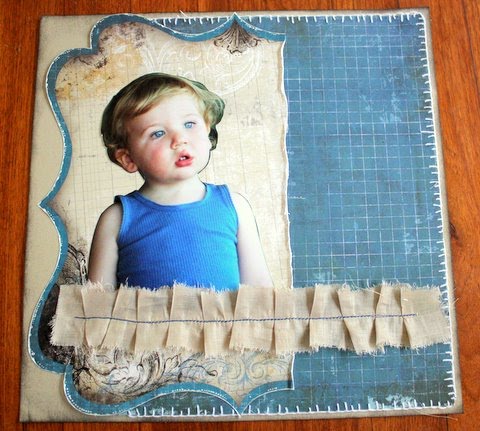
Step 2.  I cut the 'Shutter' patterned paper to 9 inches wide by 11 and a half inches.  I then blanket stitched around the edges of the paper (alternatively you can ink, paint or doodle a border around the edge).  I only stitched around three edges because the fourth won't be seen.   

 I then attached it to the right-hand side of the kraft base.

Step 3.  I cut the 'Panorami die cut' paper at around the two thirds mark.  
(Tip:  I love the die cut papers but they are a little bit more expensive than regular patterned paper so I usually cut them this way so I can get two layouts out of the one die cut paper).

I wanted to define the edge of the die cut paper a bit more so I outlined it with some liquid pearls to make it stand out. I then attached it to the left-hand side of the layout.

Step 4.  I cut my photo out as a silhouette and then placed that on top of the die cut paper and then placed a pleated fabric strip over the top to hide the bottom of the photo.


Step 5.   From the 'Mama Razzi Cut outs' paper I cut out the 'Life is Beautiful' frame and attached it to the layout.  For the title I used the Carolee Creations tiny milk chocolate alpha stickers and some fabric thickers.


Step 6.  Making the handmade flower.
 
To make the handmade flower, I cut a circle from some scrap paper the size I wanted the flower to be.  I cut a three quarters of an inch strip (by 12 inches) from the 'Mama Razzi Tabloid' paper and then crumpled it up...


then twisted it.............


Spiral the paper around as you twist the paper.
For the outside layer I just twisted the paper so that the opposite side of the paper was showing.  I glued it onto the circle and attached it to the layout.

Step 7.  I tied some paper string ribbon through two buttons and attached them next to the handmade flower.
And that's it!  Happy creating...

Please feel free to put your layouts into the Scrap N Craft with T gallery.  We love to see them and welcome projects of all levels and abilities. 


Don't forget...

Tuesday, June 1, 2010

Step by Step layout by Lisa Kamphius using the Jillibean Soup collections


If you love small prints than  Jillibean soup is a range you will love. Lisa has done a layout using the below papers and it has turned out adorable!
If you would like to purchase any of these papers please click HERE
 Here is a couple of the papers Lisa has used in her layout...

Sideways Ponytail using Jillibean soup papers by Lisa Kamphius

1.        Use the Kraft  coloured   cardstock as your base
2.       Cut “ brown rice” red side to  10 inches x 5 inches. Distress edges

 3.       Take “ red peppers”  paper and cut to 4 inches by 8 inches
Distress edges
4.       Use cherry  side of “brown rice paper and matt your photo
5.       I have used a  2 inch  strip  of  red  peppers – the  striped side and  used a scallop border punch.  Or  you can handcut your own.


6.       I have taken 2 strips of red twine and tied them together at the ends and attached across  the bottom of the photo
7.       I have used a white floral spray at the left side of the photo and attached  a  small cluster of  flowers at the top right  side of the photo
8.       I have punched a  butterfly  from the  scraps and doodled  a trail behind her.
9.       Add title and  journalling

This is amazing Lisa and thankyou heaps for sharing with us. Hope Lisa's layout inspires you to have a go using these lovely papers.
till next time
enjoy your day
luv tanXx

Monday, May 31, 2010

THE THOUGHT BEHIND THE PROCESS

Competition time.....

Another year has come around and its almost time to enter into the Scrap N Craft with T Embellish It comp. I hope you are all excited with the challenges that lay ahead of you, I am sure the challenges  will be fantastic and you will create your own little piece of magic.

Today I would like to share with you a card that I created while taking part in a Competition many moons ago. Its amazing what you can come up with when given specific guidelines. Sometimes the task set before you can seem like the largest mountain that you will never reach the top of and then other times its a breeze in the park. The idea with it is to take it in your stride, have a go, enjoy and embrace the task because sometimes the hardest of tasks will be the ones that you reap the most reward from.


From memory the challenge had to have mosaics, a heart and stamping. The stamping was formed using a  block foam stamp repeated as an edge border and then I added a strip of red bazzill and stamped white dots down that. Little mosaic squares were then added in the shape of a heart and I then defined the heart shape by sewing the heart twice on the card. Finally the word love was added. I love the versatility of the large Heidi Swapp clear stamps - I have stamped the word love on a separate piece of cardstock and then cut it out, adhered dimensional tape to give it height.

It looks a little intricate but talking through the steps is so much easier now. This would have to be one of my favourite cards I have created. I never really thought about the whole process too much. I guess you could say I just had a 'crack' at it.

So I hope that you are all getting ready for the competition - make sure you have signed up prior to the 6th of June 2010. The challenges will be amazing, along with some fantastic prizes on offer and I am looking forward to seeing what you all will be creating this year.

Have a fantastic week
tracey


Sunday, May 30, 2010

Sunday Gallery Spotlight is.... Liz Weber

How amazing is this card.....
thankyou Liz for placing your amazing work into our gallery. We love seeing  and admiring it. www.scrapncraftwitht.com.au/gallery

 Hope you all have a wonderful weekend
thanks for stopping by
take care
luv tanXx

Saturday, May 29, 2010

Saturday Scrapping Stimulus...

How can it possibly be Saturday again? The weeks feel like they're flying by!

I (Kylie) am moving house this weekend. While you're reading this I'm probably carrying a bookshelf or packing a last-minute box! LOL

So this week's quote is slightly related to moving on in your life. I quite like it!

"Don't cry because it's over, smile because it happened."

~ Dr. Seuss

Hope you have an amazing weekend, and that whatever you do, it's fun!

Kylie

Friday, May 28, 2010

Bo Bunny's Jazmyne

Hmm … how best to describe Bo Bunny’s Jazmyne limited edition glitter collection? Exotic? Definitely. Purple? Yes. Flowery? Without a doubt! Feminine? Absolutely. Versatile? Oh yeah baby!!! Ordinarily I have to confess that purple is not a colour I would first reach for when I scrap. Nor are glittery papers. But when it came to Bo Bunny’s Jazmyne range how could I resist?

Although all of the patterned papers are designed to of course work with each other, when shifting them around on my desk I found little groups of papers constantly ending up together. Somewhat perturbing you might say given the photos I planned to scrap didn’t actually work with these little ‘gatherings’. It was like Jazmyne had a mind of her own and I was under her spell. So I collected my three groups of papers and studied them long and hard, racking my brain for what photos I had which would work. It wasn’t easy. I had a stereotype image in my mind of what these papers would be used for … girly, pretty, ever so feminine pages with lots of flowers and flourishes. Now don’t get me wrong LOL, I’ll be the first person to put up my hand when the question is asked ‘who likes flourishes and flowers?’. But in this instance I wanted to do something different. I’ve been trying to move past my ‘traditional’ flourishes and flowers style and explore different techniques.

As my mind processed the three piles of papers I had collected it occurred to me that a challenge was in order. I wanted to challenge myself to use this range to create three vastly different LOs. One would be girly, one would be a bit funky and distressed, and the third would be done with a photo of men. ‘Men!’ I hear you exclaim. Okay it wasn’t a photo of the boys being blokes, it was a photo of the boys dressed up in their dinner suits for our wedding. But it was boys and the papers were predominantly glittery purples! Below are the three resulting LOs.

If like me, you sometimes find yourself at a loss for inspiration, why not try setting yourself a challenge? If nothing else it gives you a starting point from which to begin creating. Some of your best work can come from stretching your skills and trying something new. How was working with Bo Bunny Jazmyne in the end? For me it was a delightful challenge. So if purple and glitter are up your alley then you definitely must get your hands on some of these divine papers. And if they’re not, then I challenge you to grab some anyway and see what you can come up with. Alz :)


She was so proud


Tips/Techniques

* When cutting out flowers from patterned paper, flip them over on a piece of foam (an old-fashion mouse pad would be perfect) and use a Shaping Tool to mould the flowers and give them some depth and a beautiful 3D effect.

* Try matting a die-cut shape (such as the flourish on this page) to give it more definition against the patterned paper.

* When first starting your die-cutting collection, consider what shapes you are most likely to use most. For me, the Sizzix Circle, Scallop and the Sizzix Circle #3 are essential as they enable me to create perfect, good-sized, journaling spots.

* The Kaiser Pearl Strips are perfect when you want an accent without the ‘heaviness’ of cardstock or patterned paper. Don’t forget that you can then separate the pearls from the strips and use them individually as I have done.

* The Bella Large Alphabet and Number chipboard set rocks! On this LO I used a scallop circle (without a centre) and a letter ‘e’. I used a glue stick to adhere patterned paper to the scallop circle and once dry, sanded the edges. I used the ‘OMG to die for’ Smooch (Cherry Chocolate … yummy!) to paint the letter ‘e’ and once dry applied two coats of Glossy Accents. Seriously, with the versatility of this chipboard set and its fantastic value for money, this chipboard has become my new best friend!!!

Materials
Bo Bunny Jazmyne
* Verdant patterned paper
* Botanical patterned paper
* Combo Stickers
* Simply Beautiful Cardstock Stickers
Cardstock
Bella Large Alphabet and Number chipboard set
Kaiser Pearl Strip – Champagne
Fiskars border punch – Threading Water
Sizzix dies – Circle, Scallop and Circle #3
Making Memories tiny alphas – brown ledger
Tim Holtz Distress Ink – Dusty Concord
Embroidery cotton

Be carefree and joyous always

Tips/Techniques

Cut circle and scallop circle die-cut patterned paper to create hills for a landscape style LO.

Colour JEJE Sticker Sheets with Smooch Pearlized Accent Inks. They may take a little time to dry however they will give a soft, subtle effect.

Stamp on raw chipboard with a VersaMagic inkpad and then emboss with Tim Holtz Distress Embossing Powders for a wonderfully rustic look.

Use two or more adhesive 3D Foam Dots when creating a dimensional page.

Peeled back, corrugated cardboard (so the peaks are clear) makes a fabulous, inexpensive and unique stamp to use with paint.

Materials
Bo Bunny Jazmyne
* Symmetry patterned paper
* Mist patterned paper
* Peridot die-cut patterned paper
* Combo Stickers
* Mud Puddle
* Antique White
American Crafts Thickers – Rockabye – Foam – Leaf
American Crafts Thickers – Daydream – Foam – Chestnut
Making Memories Tiny Alphas – brown ledger
Smooch Pearlized Accent Inks:
* Taffy
* Grape Soda
* Gold Lame
JEJE Sticker Sheets – small dragonflies – silver on silver
Pigma Micron 01 Archival Ink Pen – black

My best man


Tips/Techniques

I found this Bo Bunny Jazmyne range to be stunning and elegant with white added for a bold contrast. Perfect for wedding pages. Plus with less emphasis on traditionally used flowers and more emphasis on darker colours, this range is ideal for pages featuring men.

Don’t like the colour of the centre of your Green Tara mini flowers? Cut them out and replace them with bling.

The Bazzill Stitch’z Templates don’t necessarily equal embroidery thread or fibres. Why not try Green Tara Paper String for something different? On this LO I didn’t want a stark white stitched flourish so I inked my Paper String (one strand of the two) with the Tim Holtz Distress Ink (Dusty Concord) and the result was a lovely mottled effect.

Use a diverse mixture of blossoms in your clusters for more interest. Here I have used a ChelleBean Romantic Rose, Prima Flower Centres, and Green Tara Vintage Blossoms.

Use a little extra glue (Glossy Accents or Pritt for example) when sticking chipboard alphas on to a surface with glitter for better (and longer lasting!) adhesion.

Materials
Bo Bunny Jazmyne
* Flower Box patterned paper
* Twilight patterned paper
* Amethyst die-cut patterned paper
* Combo Stickers
* Lavender Garden Rub-On
Smooth white cardstock
Green Tara Vintage Blossoms – White
Green Tara Flower Spray – White
Green Tara Organza Flower Glitter Design ribbon
Green Tara Paper String – White
Green Tara Mini Flowers – purple with yellow centre
Smooch – Cherry Chocolate
Tim Holtz Distress Ink – Dusty Concord
Bazzill In Stitch’z Templates – Formal Flourish
American Crafts Thickers – Nutmeg – Glossy Letter chipboard – White
Basic Grey Bling It – purple
Prima Flower Centres – Dynasty Amethyst
Kaiser Pearl Strip – Black
ChelleBean Designs Romantic Roses - Purple
Inkssentials Glossy AccentsMaking Memories Staples – Metallic

Please email us or ask us about all these above products, If we don't have them in stock we are more than happy to get them in for you.

Here is the amazing Bo bunny Jasmyne Range which is glittered and selling extreamly well... Grab your own Today so you don't miss out!.CLICK HERE to go to our shop full of yummy things to create with!..

Thank you for stopping by and hope that Alz's creations inspires you to have a go. If your local pop in to see these amazing layouts in real life! they are incredible!
till next time and have a wonderful day
luv tanXx

Thursday, May 27, 2010

Check out the NEW Ruby Rock-it Ranges... YOU WILL LOVE THEM!!!!

We have 2 new collections for you to enjoy! I have played with them and wow are they amazing. With the papers being a wonderful weight to be able to distress and do so much with they are one of my most favourite papers to work with.

Come and check them out in our store TODAY! order yours to be the first to receive them and so you don't miss out! These ranges are at a brillant and afordable prices and yet the quality will amaze you and be in love with them as much as I am...lol!

Here is the SummerHouse Collection, those of you that did my class at SIA would have seen these first hand and how wonderful they are!

And a close up of these beautiful papers....

To purchase this collection... CLICK HERE!....

***********************
Here is the Upstairs Downstairs Collections


Here is a close up of these papers.... yumo!
To purchase this amazing range... CLICK HERE!

We will show you some samples of use of these soon!....
Thanks for looking and stoping by we love your comments
enjoy your day and take care
Luv TanXx

Wednesday, May 26, 2010

When a photo DOESN'T paint a thousand words

Have you ever wanted to capture ‘something’ on a layout but just not had the photographs to support what you want to capture? Perhaps a distant memory or a funny story for which there are no photographs? Maybe you just have ‘something to say’ and no supporting material. Whatever the case, why not try creating a layout without photographs? If you find journaling a breeze, then you’ll love this idea. If journaling just isn’t your thing or its something you struggle with, then perhaps having a go at this type of layout will be what you need to get your pen going.

A little while ago I was approached by a friend (heh Jen!) to do a layout for an article she was writing for Scrapbook Creations. Jen wanted to know if I would do a layout for her about what it was like living with MS. Those who know me know I have no difficulty scrapping about myself and, in fact, find it to be quite therapeutic; and that I am never lost for a word and so find journaling to generally be a large part of my scrapping projects. As I have always been very open about having MS I didn’t have any concerns about ‘sharing’ my story with others. Who knows, maybe it might help someone else living with MS? So I didn’t hesitate to say yes. This ‘challenge’ was so my thing that I figured I’d have it in the bag. That wasn’t to be the case. The problem? My photos.

Quite some time ago when I received a new camera for my birthday, one of the ‘subjects’ I played around with photographing were my daily syringes with the bright yellow, bio-hazard sharps container in the background. (They happened to still be on the kitchen table when I opened my presents!) I’m delighted to say I got some great pics and some fabulous ‘depth of field type’ shots (my camera/photo lingo is not up to speed) but that trying to scrap them for this article was proving to be a nightmare. What I wanted to ‘say’ had nothing to do with these syringes really. I mean the daily injections were part of it, but they weren’t the whole story. So I figured I’d ditch the photographs and actually figure out what the ‘story’ was. I thought if I could concisely figure out what I wanted to ‘say’ that I could then take photographs to support my journaling. I mean scrapping is about the photos right? Wrong. Well at least not necessarily so. Once I figured out the message I wanted to convey, I realised that for me, scrapping was about more than the photos. It was about the memories, the feelings, the emotions, the journaling. It was a creative way for me to express things I would ordinarily be unable to verbalise. I needed to go down the path of scrapping where there are no photos. I was somewhat terrified one might say.

After a couple of weeks of (hopelessly) trying to ignore my terror (and the looming deadline), an image started to form in my head of how I could best express what I wanted to say. I had tried the story telling style of journaling and it felt to me like I was giving a lecture. I tried to soften it only to find it read like a ‘pity poor me’ diatribe. I didn’t want to invoke pity. I didn’t want to educate anyone. I didn’t want to be clinical. I didn’t want to be emotional. I didn’t want the MS to define me. That’s when it hit me. Photos don’t need to define my scrapping. Journaling doesn’t need to define my scrapping. A certain style doesn’t define my scrapping. I define my scrapping. So with that thought in mind, I started to ‘pull’ words out of my previously scrunched up and thrown out journaling. I started to play with imagery and symbolism. I would go red ... it is the international colour for MS. I pictured my life as a tree ... old leaves falling to the ground to be replaced by new ones. Rolling hills representing (for me) peace and harmony in nature. A cottage representing home, a place where love grows. A bird to symbolise peace and freedom, and the grim possibility of being trapped and caged. I had not done collage style work before. This was so far out of my comfort zone it really wasn’t funny. But when I stopped and thought about it, so was standing up in front of all of Australia’s scrapping community (well at least those who read Scrapbook Creations!) and saying ‘heh, this is what life is like for me living with MS’. From that point on a clear picture formed in my head of how I could best (in my eyes anyways) express what I wanted to say. I sketched my ideas, surprisingly found just the products I needed in my stash and I started creating.


Sadly, my husband doesn’t ‘get’ the resulting layout (well not without a long, drawn out explanation of it LOL). I don’t really know at all if anyone else ‘gets’ it. But I got it. It was clearer than any photo could ever be. It was more powerful than any speech could ever be. It was raw and it was pure. It was honest and it was from the heart. Isn’t that what scrapping is meant to be? Perhaps not for everyone, but definitely for me. My layout “MS & me” was eventually published in Scrapbook Creations No. 76. I am very proud of this LO and the journey it represents in its creation. I am inspired to continuing scrapping without photos (although not all the time) and am relieved that in a life full to overflowing with memories but devoid of photos, that I can still scrap my story. I hope that in some small way my story, helps you to truly express yours. Alz :)

Materials List:

Prismatics cardstock

Scenic Route Paper Co patterned paper:
Cape Town Oswald Road Red
Sumner Cherry Avenue
Sumner Ryan Avenue

Chipboard:
ScrapFX embellishments – Tree large
Scrapware chipboard house
Maya Road fresh chipboard – Birds of a Feather
Collections chipboard hearts
Buzz ‘n Bloom chipboard
Scenic Route chipboard – Everyday Moments chipboard circles

Alphas:
Font – Century Gothic
Carolee’s Creations Adornit Sleek Red Alphas

Li’l Davis Designs Vintage Wood Shapes - Butter
Green buttons
Cuttlebug alpha dies – You’re Not The Boss Of Me
Sizzix die – Cloud #2
Embroidery and machine cotton

Tuesday, May 25, 2010

Sophie Range of Papers from Bo Bunny!

These are one adorable range of papers from bo bunny.... called 'sophie'

You can check out what we have left in this range HERE!

1. Use a plate or a template on white cardstock. I bought a chipbaord round circle and use it for everything.

2. Spray glimmer mist or smooch spritz over template

3. Handcut flowers and place around sprayed circle

4. Attach title, bling and any extra embellishments

Monday, May 24, 2010

THE THOUGHT BEHIND THE PROCESS

Blocks,Rub-ons, white,red & aqua - what a great combination.

Sometimes its hard to think of something different and edgy when you are wanting to put together a layout that is different from what you have been creating. And sometimes you know whatever is in your mind you really should not venture down that path because it will turn out to be not quite the success you were planning.

The layout today that I have chosen was that - it was a 'safe' for me. I was creating a lot of layouts this particular weekend and my scrapping was feeling a tad stale, I wanted to do something different but knew that I was tired and really should not delve into that portion of my creativity feeling the way that I was.... so .... I played my safe card. This is the layout below "Swimming Diva"


I found some fantastic double sided papers that were my favourite colours, dug through my stash of rub-ons to find the flowers. swirl and 'fun' wording that would suit my picture. I then had my white pen, some blue sticker alphas and some Heidi Swapp chipboard alphas at the ready to create the layout.

I chose four colors for this layout - they all came from the striped patterned paper and complimented the photo well. The background cardstock was brown bazzill which blended well with my daughters hair and with the brown stripe in the patterned paper. I liked having the red patterned paper as it complimented the aqua and really gives the layout a lift... 'a summery feel'.

I blocked out two thirds of the cardstock with printed papers and then set about adding my photo which I mounted on cardstock and used my white uniball pen to frame. I used the word fun at the top of the layout and added white flower rub ons to the right edge of my photo & to each end of the word swimming. When adding the title it was just a case of 'these were the chipboard i had'. I added a hand drawn border using my white uniball pen and a ruler this tied it all together.

In the end I am glad that I did not sway onto a different path with this layout and I am happy with how simple yet striking it has turned out. Red is a favourite colour for me as i know that it draws your eye.... I just hope that my photo can be as captivating as this one every time that I use this color from my stash.

Have a great week
tracey

Sunday, May 23, 2010

Sunday Gallery Spotlight is ........GILLY!!!!

Morning everyone!


Hope your sunday is a wonderful one and you all have a fantastic day.

For our sunday gallery spotlight is.... GILLY

I have found this amazing book that was made into a receipe book and looks amazing.


I hope this inspires you to want to have a go and place your fav recepies in a lovely book like this or make one for a special friend.

If you would like to see more of Gillys beautiful work check out her blog HERE!

Thanks for popping in and feel free to comment in our gallery
http://www.scrapncraftwitht.com.au/gallery
we love to hear your comments

If you Need to do some shopping please pop in and check out out SPECIAL SECTION... you may find just what your looking for at a fantastic bargin.

We have uploaded some NEW prima goodies if you want to look in the NEW PRODUCTS section to treat yourself with something special.


enjoy your day
Luv tanXx
http://www.scrapncraftwitht.com.au

Saturday, May 22, 2010

My Mind's Eye Quite Contrary

What is there to not love about pretty much anything My Mind’s Eye? The weight of the paper is fabulous. The texture oh so sublime. The double-sided patterned papers are such good value. The co-ordinating die-cuts, stickers and journaling notes are something I can’t do without. Overall the designs are just to die for. Wouldn’t you agree?

Recently I got to play with some of the MME Quite Contrary ranges … Little Boy Blue and Jack & Jill. It’s hard for me to not wax poetic about these ranges when MME is one of my favourite brands. But honestly they were fabulous to work with. Initially when mucking about with the Little Boy Blue Curious range I was thrown by the heavy reliance on the reference to owls. I mean haven’t we been there and done that already? But then I thought ‘why fix something that isn’t broken?’. It seems as though owls are going to be with us for perhaps much longer than anyone expected.

I went on to create two LOs with the Little Boy Curious range. Well actually two and a bit but I’ll come to the ‘a bit’ bit later. The first one is of Tan’s DS clowning around one casual day when I was up that way last September. The title may be a bit ‘old hat’ but was so appropriate what else could I use? The second LO features photos Tan took of her DH and DS that same day. I struggled with a title for this one but in the end spoke from my heart and feel it came together nicely. The ‘a bit’ LO combines both the Little Boy Curious range with the Jack & Jill range. Although one is meant for boys and the other for girls, typically with MME they both compliment each other perfectly. Again, I struggled with a title, but again I spoke from the heart and as a result (as with the LO “What You See”) no journaling was required.
I’d like to share with you the three LOs I created using the MME Quite Contrary range, together with my materials lists and some tips and techniques. I hope they provide you with some inspiration and perhaps even get you using some of the gorgeous My Mind’s Eye papers Tan has in store. Alz :)

Such a Hoot

Tips/Techniques

Use a palette knife to scrape paint onto cardstock to create a unique background.

Use the pattern in patterned paper to cut an interesting border.

Use Smooch Pearlized Accent Ink to highlight sections in die-cuts.

Adhere die-cuts to JAC paper, cut out and then adhere to chipboard. Once cut out of the chipboard you have a dimensional accent.

Inkssentials Glossy Accents are perfect for highlighting ‘eyes’ on accents/papers.

Materials

MME Quite Contrary Little Boy Blue
* “That’s My Boy” Tree patterned paper
* “When I Grow Up” Owl be There patterned paper
* “Curious” Owl die-cut
* “Little Man” journaling card
* “Curious” journaling card
Bazzill Basics Dotted Swiss cardstock
Paper Raffia – Cocoa
Magic Mesh
Smooch Pearlized Accent Ink - Molasses
Kaiser paint – antique
Inkssentials Glossy Accents
VersaMagic chalk inkpad – Jumbo Java
AC Thickers – Rockabye – Foam – Leaf
AC Thickers – Daydream – Foam – Chestnut
MLS mini alphabet stickers – turquoise
Chocolate Zig Writer
Making Memories staples
Colop date stamp
Chipboard and JAC paper

What You See

Tips/Techniques

Torn patterned paper or cardstock creates both a rustic and relaxed feel.

Alter the colour of fabric by stamping with Tim Holtz Distress Inks and then spraying the fabric with water to help blend the inks.

Using one photo twice can add more emphasis to the central photo.

Using handmade papers as your background instantly adds texture and interest.

Add dimension to die-cuts by (in this instance) scoring the leaves and folding them.

Materials

MME Quite Contrary Little Boy Blue
* “When I Grow Up” Owl be There patterned paper
* “Curious” Who Loves You patterned paper
* “Curious” Accessory Sheets
Green Tara handmade mulberry paper – embossed black (reverse)
Tim Holtz Distress Inks
* Crushed Olive
* Tumbled Glass
* Pumice Stone
Kaiser paints – Seabreeze and Mud Puddle
VersaMagic chalk inkpad – Jumbo Java
AC Thickers – Rockabye – Foam – Leaf
MLS mini alphabet stickers – Turquoise
Sewn fabric strip by Nicole Amber (thanks Nic!)
Owl buttons by Kitty Robot
Chocolate Zig Writer
Making Memories staples
Colop date stamp

You

Tips/Techniques

Twice the photo equals twice the fun!

Die-cut small scraps of materials into shapes and set aside for future use … in this instance the red suede dots (leftovers from another project) were the perfect finishing touch.

Take advantage of small tears in handmade, textured paper to create larger tears to have accents ‘peep’ out from.

Incorporating your journaling into your title makes for a clean LO.

‘White space’ (or black as the case may be LOL) draws attention to your photos.

Materials
MME Quite Contrary Little Boy Blue
* “Curious” Who Loves You patterned paper
MME Quite Contrary Jack & Jill
* “Be Happy” Blissful patterned paper
* “Life is Good” Serene Spots patterned paper
Green Tara handmade mulberry paper – embossed black
Sizzix Boss-O alphabet dies
MLS mini alphabet stickers - Gumball
Basic Grey decorative paper clips – Sugar Rush
Jillibean Soup Canvas Flowers – Red Polkas
Prima Embroidered Tabs – Play
Chatterbox Ribbon & Trim – Ruban
Sewn fabric strip by Nicole Amber (thanks Nic!)
Penguin and other polymer clay buttons by Kitty Robot
Various buttons
Felt
Suede
Ink
Colop date stamp
Chipboard and JAC paper

Friday, May 21, 2010

Saturday Scrapping Stimulus...

Welcome to another weekend, hopefully full of creating! If no creating is actually done, at least you can THINK about creating!

I'm feeling a bit cheeky today...

"If you can't say anything good about someone, sit right here by me..."
~Alice Roosevelt Longworth

I want to invite Alice Roosevelt Longworth to dinner. She sounds like fun!!!!

Have a great weekend...

Kylie