I have a new blog!

If you want to see only my creations please come and check out and follow my new blog http://www.tanyah-payne.blogspot.com

Tuesday, November 30, 2010

Let the papers do all the hard work


These terrific Teresa Collins papers did most of the thinking for me - flags to cut around, stars to replicate as a design feature and I could even use the label as part of the title. I did add a cardstock rosette ( had to do some thinking myself).

CELEBRATE LIFE

I used:

Teresa Collins - Celebrate papers

aqua, white and black c/s

7 small brads

7 Gypsies red ribbon

bella chipboard alphabet

Sam and Lucy tiny alphabet

string


My photo was a 6" x 4" landscape


Instructions:

1. Distress edges of 8 1/2" x 6" piece of star paper. Attach 3" down from top of black c/s.

2. Attach ribbon across 7 1/2" down from the top. mat phot in white then aqua c/s. Ink edges. attach in middle of star paper.

3. Cut a zig zag along one edge of 1 1/4" x 12" strip of reverse of star paper. Distress edges then crumple up. Attach under photo.

4. Cut out 6 flags. Cut 1/2" off the top of one flag and ink the edges of all flags. Attach trimmed flag and one other up against photo. Attach other flags in an arc above photo.

5. Punch or cut out aqua stars and attach chipboard letters. attach to flags with 3D tape. tie bow in string and attach with brads at corners of flags. Tie other bows and attach as shown with brads.

6. Rosette: Cut a 1" x 12" strip of aqua c/s. Score every 1/4" and concertina fold. Join ends. Push centre down and in over a c/s circle covered in glue. Hold till glue sticks.

7. Punch out a 1 1/2" circle from star paper. Attach to top of rosette. Cut out another star and poke a brad through the middle. Attach with 3 D tape over circle. Fold ribbon into a V and attach to back of rosette then attach to corner of photo.

8. Sew string along reverse star paper strip. Cut out 'celebrate' from the paper label. Ink edges and attach.

Monday, November 29, 2010

Little Yellow Bicycle Snugglebug Range - a double layout by Sue Smith

Last week I did a layout with this range in the blue-tone 'boy' colours (which if you missed it can be seen here). This week I have done a double layout using the pink 'girl' papers in this range....


Here is a list of the products I used for this...

* Cardstock in white and a pale pinky-brown

* Little Yellow Bicycle 'Girl Playtime'

* Little Yellow Bicycle 'All Over Snugglebugs'

* Mesh Ribbon in Pink/Gold

* Heidi Grace Pocket Frames

* White flower-shaped brads

* Black Sharpie Pen

* Dusty Attic Chipboard Doily

* Clear embossing powder

* Tim Holtz Distress Ink - Victorian Velvet

* Basic Grey Rub-ons

I started with 2 sheets of the pale pinky-brown cardstock, and over the top I placed 2 sheets of white cardstock, hand-scalloped and cut around the edge and then doodles the outline of the scallops with the black Sharpie pen.

I then cut the LYB 'Girl Playtime' paper into strips and spread them out over the double pages.

With a sharp scalpel I cut out some of the 'bug' detail on the left-hand strip to overlap the main photo....


I wanted to outline each photo, but none of my white pens would write successfully on the shiny photo paper, so instead, I scratched an outline with a kitchen skewer and then arranged the photos across the 2 pages over a strip of mesh ribbon. I also highlighted the main photo with a plastic frame cut in half and arranged at an angle.

I cut the title from LYB 'All Over Snugglebugs' paper using my Pazzles Inspiration Diecutter and outlined each letter with the black Sharpie pen....


For my journalling I used a chipboard circle which I inked and embossed and then topped with the Basic Grey rub-on heart....


I then cut out individual 'bugs' from the LYB 'All Over Snugglebugs' paper and attached them with foam DST to give them some dimension.

I hope you like my 'girl' version using this wonderful range from Little Yellow Bicycle...I am TOTALLY in love with it.

Until next Monday....happy scrapping everyone!! xx

Sunday, November 28, 2010

A non-traditional Christmas using Crate Paper - A Layout by Annie Zorzo

Christmas has landed in our house!!!  I'm not a real tradionalist going with the 'norm', so we've starting a new family tradition where we set up the Christmas Tree on the 24th November.  I know some people say it's bad luck to put it up before the 1st December but it just seems like it's up and down so quick...besides my eldest was so excited and I just couldn't deny that kind of Christmas spirit. 

I'm also not a huge fan of using papers just because they have a theme associated with them.  So this week I've made a Christmas layout using the new 'Season Collection' by Crate Paper....and I love it.  I also got to play with some new products that I can't wait to tell you about so lets get down to it.  Here is my non-traditional Christmas layout....


Products I used include:
Love paper from Crate Paper's 'Season Collection'
Cardstock - white and blue
Viva Ferro metallic texture paste
JudiKins Embossing Powder - Sticky Stuff
Flocking - White
Glimmermist - Indian Corn

Chipboard Christmas Tree
Kindyglitz - Crystalina
Americian Thickers - Lullaby Glitter
Bella Glittered Chipz
VersaMark Water Mark
Template
Ribbon - Dotted

Fundamentals Felt Icons - Love Heart
Bling Flourish Puffy - Red
Paper Flowers
Versa Colour Ink
Zig Pen

I love how this layout has all come together.  Rather than going for the Christmas Papers that you might reach for on a Christmas layout, I grabbed the Love paper from Crate Papers Season Collection and made 'Love' my central theme.  I hope you like it as much as I do!

I'm not going to do a step-by-step for you this week on the layout as I want to tell you about two techniques with texture paste and embossing powders that I used making they layout.  Seriously they are fabulous.  Tanyah gave me a little sample to go and play with and I'm going to be running back to the shop to get my hands on them to keep!


VIVA FERRO METALLIC TEXTURE PASTE
I'm loving this texture paste.  I just want to keep touching the finished product and it gave the whole layout a new feel.  I cut a love heart from blue cardstock but to simply put that down on the layout would be a bit boring.  I grabbed my Doddle Genie Whimsical Template, the Viva Ferro Metallic Texture Paste in Silver and got messy!!


1. Lay what-ever template you're using over your carstock

2. Using your finger, scope up some Viva Ferro and start working it into the template.
HINT: Make sure you hold it down firmly so it doesn't move and smear the areas you've already done.  HINT: Paint and foam brushes don't work as well as your finger.  You want to really push the texture paste into the template.

3. Once the desired area is covered, carefully lift up your template
HINT: I cleaned up with baby wipes

4. Leave the cardstock to dry.
HINT: I only used a thin layer of texture paste so drying time was quick.  If you apply thicker layers you'll have to leave it longer or use your heat gun.


JUDI-KINS EMBOSSING POWDERS - STICKY STUFF
Now the Judi-kins Sticky Stuff is just as fabulous as the Viva Ferro and so versatile.  Basically you would emboss as you normally would but once you've finished with your heat gun, it leaves a sticky surface on your project.  To this you can add anything!!!  Glitter, flocking, gold/silver leaf etc and they will all give your project a completely different look.

I do apologise here, as the photos I took of the different steps have come up really blurry, but here is a detailed step by step.

1. Using a VersaMark Watermark ink pad, I inked up my Chipboard Christmas Tree.
2. On a central folded sheet of paper, I sprinkled Judi-Kins Sticky stuff over the top of the inked tree.  Carefully picking up the tree and shaking off the access onto the paper, I then folded the paper and gently direct the access powder back into the container.
3. I heat embossed the powder.
4. Once all the powder has turned transparent, I added white flocking, making sure to press it down to stick onto the Sticky Stuff.  I returned the access flocking into the container just like I did with the Sticky Stuff.
5. I then sprayed my white flocking with Glimmermist
6. To add some extra sparkle to my Christmas tree I added some Kindy Glitz

And here is a close up of the finished Viva Ferro and Judi-Kins Stick Stuff...

I hope I've added a few more things into your scrapbox that you will get heaps of use out of - you won't regret either of these or the Season Collection by Crate Paper.  Pop on over the Tanyah Shop - Scrap n Craft with T now as she still has huge savings and specials on these products and more!  See you next week.

Saturday, November 27, 2010

A Glimmer Mist card to share by Tanyah Payne

Hi everyone, hope you all having a lovely weekend, enjoying catching up with friends, family and work mates as we all are going to funtions here and their for all sorts of reasons....

Today I made a card as my beautiful Nanna is 80... She is a very special person in my life and was a treat to see her with all my cousins, aunty's and uncles today.

Here is the Card I created for her..

This card comes with a warning..... Inky fingers!...lol


Products Used:
Instructions
  1. Firstly choose 3 colours of spray mist. I used creme de Rouge & Purple pansy Glimmer MistFIRST
  2. I sprayed accross the top of the Do Crafts Cards using both these colours to give a different shade of colour 
  3. Wait to dry
  4. I covered around the door open sections with scrap paper
  5. Placed the small crafters workshop Templates over the top
  6. Then sprayed the second colour of Maya Mist Plum Metallic
  7. Lifted the crafters workshop Templates off
  8. Waited for the card to dry and removed the covered areas
  9. Adhered the My Minds Eye pattern paper under the card
  10. Placed a quote inside the card
  11. Adhere the flower Do Crafts flower stickers and pearls
So Their you have a lovely card for someone really special just like my nanna... Isn't she wonderful to let me take this pic of us today! luv you nan!

 Hope you have enjoyed this card as much as i did making it.
Have a  wonderful weekend, till next time
TanXx

PS .............IMPORTANT NEWS!.... CHECK OUT OUR SITE... EVERYTHING IS ON SALE AND MUST GO!..... NOTHING UNDER 30% OFF!........www.scrapncraftwitht.com.au

Friday, November 26, 2010

Two quick and easy layouts by Ingeborg Dijkstra

Sometimes I really want to make 'quick and easy' layouts AND use my stash. I obviously love buying new products, but I do like to challenge myself by using products that have been collecting dust for years too! An example of one of those 'dusty products' is the set of badges (Bon Voyage & Vaction) from American Crafts.

But ... I also have used a new product from Words or Whatever (WOW): the chipboard word 'Road Trip', which is sold in Tanyah's store. I painted the chipboard black. A chipboard shape like this can be used as a title and embellishment at the same time.


I used sheets of white cardstock as a base for both layouts. I cut a sheet of patterned paper Trapeze (Fun Fair Collection by KaiserCraft) in half and used one half on one layout and the other half on the other layout. I repeated this with the Sideshow paper from the same collection.

I borrowed some stamps from a friend with a road trip and travelling theme. The set I used is called 'Road Trip' (made by Recollections).

I added my photos, some badges and a title with foam letters . Finally I made a black outline around the layout. The black outline has been made with a handy new product: The Pearl Pen from Viva Decor. Done!

Thursday, November 25, 2010

School days - Cosmo Cricket layout

2010 has  beena  special  school year for our family.  Teleah  started  Pep and   2010  will be the only year  that all of my children are at school at the same time.  Joshua  starts High school next year.  With that in mind, I wanted  to document that event  - staring with a photo of the  2 of them together.  The Cosmo Cricket  papers  are pefect  for these school layouts~

2010 – A school layout

Products Used:


1. Use the teal cardstock as your base

2. Take”Now thats a good thing” from Cosmo Cricket and cut to 7 inches across and 8 inches down. Ink edges


3. From the scrap that remains cut to 5 inches x 9 i/2 inches. We will use the coloured striped side. Ink edges


4. Take “ Homework” by Cosmo Cricket and cut to 3 ½ inches by 11 inches . Ink edges.

Adhere with pencil side up.

5. Adhere photo. I have used a 6 x 4 portrait. Leave a gap at the top to slide in the Maya road pocket for any journaling or samples of writing etc.

6. From Cosmo Cricket “Now thats a good thing - select desired cutouts , phrases or journal blocks. I have cut SMILE and a journal block. Adhere


7. Paint chipboard bird - I have used Tim Holtz distress paint.


8. Attach journal block and any words – I have raised SMILE up on pop dots.

9. I have then cut out two pencils from th scrap paper and have these coming out from the diecut


10. Slip Maya road tag in behind the photo

11. Add inked chipboard buttons


12. Add title and journaling


So get into Tanyas  store and check out these  seriously  SCHOOL papers!!!!

Wednesday, November 24, 2010

Watercolour Backgrounds with Distress Inks - Nicky Amber

Tanyah has just received a new shipment of Distress Inks in store (which are selling at a fantastic price!) so I thought I'd share a technique using them for all those lucky people who have snapped themselves up a bargain.

I'll be using Distress Inks to create a watercolour background.


Step 1.  To start off...select two or three colours and stamp or swipe the inkpad onto a craft mat or non-porous surface.

Step 2.  Using a mini mister...spray the ink until large droplets form.

 Step 3.  Press or swipe your paper into the misted ink.


Step 4.  The colours will 'bleed' into each other producing a lovely watercolour background.  If you would like more colour you can swipe and reswipe until you are happy with it.

The dried result (after doing some reswiping)......


With the watercoloured backgrounds I have made some gift tags.


To make these, I have used my new Spellbinder Nestabilities dies that Tanyah also has new instore.


 To dress them up I've used the Prima calligraphy script stamp
  and the Sullivans Best Friends stamp

 Resulting in these......
 

If you are local and interested in learning more Distress Ink techniques just let Tanyah know and we can organise a class to help you make the most of your Distress Inks.

Happy Creating...xxxooo

Tuesday, November 23, 2010

Altering Die Cut Papers with June Burtonwood

"Change is inevitable - except from a vending machine."

Die cut papers are great to use if you want a change from straight edges. You can use them as is, cut them into section and change the positions or simply ink, mist or spray them. I love the distressed look so today I'm sharing ways of altering a diecut paper for an aged tattered look.


Products Include.

  1. On this layout, My Regret, I cut out an inside shape - a circle in my case. Distressed all the inside and outside edges. Because my paper was a dark colour I left the white edges but you could also ink them.
  2. The reverse of most die cut papers is white so to add interest on the bits I was curling over I stamped a small script stamp that gave it a pattern - you could also ink in a matching colour. Then I tore and curled over the edges revealing the script.
  3. My biggest tear gave a spot to embellish in matching net - lace, flowers etc would also work well.
  4. I only removed a few of the punched out dots and curled up the scalloped edges. You could add your own random holes if the paper didn't have any.
  5. Before attaching the inside and outside pieces I made sure they were distressed enough for the background cardstock to show through.
  6. I could also have scrunched up and inked the paper. Another way of distressing the paper would be to sand it like I did the painted chipboard leaves and photographs.
  7. Try to vary the distressing techniques you use over all in your layout. Using the same on everything isn't as interesting. I have used sanding, inking, tearing, curling and edge distressing.


enjoy
June

Monday, November 22, 2010

Little Yellow Bicycle SnuggleBug Range - a layout by Sue Smith

Today's layout I've done combines two of the most important factors (in my opinion) of a great layout....beautiful photos and fabulous papers.
The photos I have used I took a couple of days ago, and are of my nephew and his 3 week old son, and I feel so privileged to have been able to capture a special private moment between the two of them....

NB: Click on the image for an enlarged view....


The second part of this equation comes courtesy of Little Yellow Bicycle and their gorgeous SnuggleBug Range.

For this layout I started with LYB SnuggleBug Boy Playtime paper which is actually cardstock thickness with the main design embossed to create a beautiful luxurious finish.....


I then doodled around the edge with a design that echoed the antennae of the bugs in the paper.
NB: When you are doodling, don't be scared to experiment with different lines and shapes...the less you get hung up about perfection, the better the result will be...just let your hand have free range, and you might be pleasantly surprised where it takes you and the results you achieve.....


While these photos captured a very special moment, the background detracted from the emotion evoked in the image, and because it was a clean image, I decided to cut out the subjects to polarise the focus of the shots. I then inked around the cut edges with a pale brown ink to take away any stark white edges that might be visible.

The scalloped strips sitting underneath the photos take away the sharp edge at the bottom of the photo. These were hand-drawn scallops and cut from the LYB SnuggleBugs - Boy All Over Snugglebugs paper (double-sided).

I finished off the layout with some 'bug' cut-outs from this same paper and stuck them down with foam tape to give a slight 3D effect, and three co-ordinating 16mm buttons in the top righthand corner.

The title was made with Paper Extra Foam Stickers and the wording made with a Dymo Labeller. I then doodled around the edge of the title and the wording with a black gel pen.

I don't know about you, but sometimes I manage to create a layout that really touches me, and I find it hard to stop looking at what I've created.....this layout is one of those for me. That for me is the real joy of scrapbooking...to create art with paper and have it evoke emotion in the viewer (and the creator...lol).

See you next Monday with some more scrappiness!! xx

Sunday, November 21, 2010

New 'Season Collection' by Crate Paper - A layout by Annie Zorzo

Oh my Goodness!!!!!  If you haven't already been online (or if you're local) to Scrap n Craft with T, then don't worry about this blog entry - head over there right now!!!!  I visited Tanyah the other day and the amount of new goodies she has in is to die for!  Great specials on a range of Tim Holtz products (metal embellishments/distress inks), plus amazing prices on Martha Stewart Punches and Cuttlebug and Spellbinder dies!  While you're there, check out the new Season Collection by Crate Paper and grab it too.  I'll show you a few projects over the coming weeks that you can use it with.  Now, seriously, go and be quick, because at these prices, they're not going to last long!!!  I look forward to seeing you back here when you've finished shopping!

La-de-dah-de-dah........Ok, finished shopping?  Hope you grabbed some bargains!

For today's project, I wanted to make a fun layout of my youngest daughter on the swing using multiple photos.  The colours in the Season Collection by Crate Paper were perfect for what I wanted to do.
 

Products I've used for this Layout include
* Double Dot cardstock
* Crate paper - Season Collection Spring
* American Craft Thickers
* Kaisercraft Kidzone Clear Stamps
* Versa Colour Ink
* Paper Flowers

* Brown Zig Pen
* Buttons
* Thread


I haven't got any step-by-step photos for you this week but here are the instructions so you can make it yourself.
1.  The Double Dot cardstock has small raised dots.  Lightly ink the raised dots to give a subtle pattern - I've used Lime ink.
2. Ink the edges of the cardstock in Pinecone.
3. Cut the flower side of the Crate Paper Season Collection - Spring paper to measure 9.5"w x 10.75"h.
4. Ink the edges of the Spring Paper and line up with the bottom edge and fix into place with equal gaps on the left, right and top sides.
5. Using the reverse side of the Crate Paper Season Collection - Spring Paper, cut a random scalloped edge with the highest scallops measuring 2.25" from the bottom edge.
6. Ink the edges and fix this scalloped edge along the bottom edge of your layout
7. I've printed 4 of my photos in 2"x3" size and a main photo in 3"x5" size.  These smaller sizes allow alot of photos without cluttering up the Layout with photos.
8. Tuck your photos in behind the scallop paper.
9. Add a title to the top left of the photos and a sub-title along the scalloped paper edge
10. On contrasting colour cardstock, stamp the round Kaisercraft Kidzone stamp, cut out and position in the top left hand corner of the Season Collection - Spring Paper
11. Layer some coloured paper flowers - taking the colours from the Season Collection - Spring Paper, and top with a button.  Position around the stamp.
12.  Finally doddle away - immediately around the Spring Paper, I've added my journalling.  I've then doddled a boarder around the Double Dot Cardstock, around the scallop edges and around the paper flower edges.  I also went over my sub-title a few times to make it abit more scratchy and fun.


There was one last embellishment that I was going to add but at the last minute decided against it.  I thought I would share it anyway since you might want to add something like this.  Using a chipboard tree (tanyah has lots in the Scrap n Craft with T store), I've used the same stamp as before and randomly stamped over and over again in brown, green, blue and red.  I thought it was a bit too busy for this layout but I'll add it to my stash for something else.

I hope you like the new Crate Paper Season Collection and I look forward to bringing you more projects with this beautiful collection in the coming weeks.  Now go and enjoy your day....and go shopping at Scrap n Craft with T if you haven't already!

Annie x

Saturday, November 20, 2010

Misting Ideas

Hi there everyone and welcome to another week!

Since the arrival of Glimmer Mists by Tattered Angels, we scrappers have been using coloured mists to create subtle effects on our scrapping pages and OTP's. The colours, sheens and qualities of these mists vary from company to company and today I'd like to show you a project using Maya Road Memory Mists.
These Memory Mists can be found in the SNCWT shop HERE.

The Maya Road Memory Mists have been created with the chipboard enthusiast in mind - so the colours are brighter, stronger and have more vibrancy.
These mists look wonderful just sprayed directly on a page, chipboard or used as a background, such as the pictures below show you.
Simply follow these simple steps and you could also be creating your own backgrounds in a fabulous array of colour - the choice is completely yours!

You Need:

Some artists' Masking Fluid - available at scrap n craft with t - maya resist!
Essentially masking fluid is a liquid polymer paint (like liquid rubber) that dries in a few minutes to form a coating over your background. It can be applied however you like, although this time I have used a thin paintbrush and I have painted words on the base cardstock with it.
Photobucket

Photobucket

After a few minutes' drying time, you can spray your Mists over the top of the masking fluid or even flick it with paint in numerous colours. When spraying onto cardstock, it might be worth taping your cardstock to a flat surface to prevent warping.
Photobucket
Once your masking fluid is dry, you can peel it off the base card. It simply pulls or rolls off, leaving the surface underneath clean and dry.

Photobucket
Simply scrap over the top as usual and VOILA! You have a custom made background using Memory Mists that people will be itching to copy!

Photobucket

Now go get messy :)
Have fun everyone!
Sares x


WE HAVE 15% OFF ALL GLAMMER MIST AND MAYA MIST THIS WEEK!

Friday, November 19, 2010

Step-by-step layout using a sketch by Ingeborg Dijkstra

As I mentioned last week, I have been to Paris with an Australian friend of mine. It was so wonderful to catch up with her! The weather in Paris was wet and cold, but we refused to let the rain spoil our mood! But ... I did want to create a layout with lots of 'rain drops' because we surely saw lots of those. I used 'splat stamps' to create this look. Anyway, I started with one of my own sketches:

I first cut the papers in a thin strip, a larger strip and a large piece to mat my photos. I used two sheets of doubled-sided paper from the 365 Collection by Pink Paisley: Day Dream and Be Free.

To create the banner I use a piece of brown string. I used scraps of the Day Dream and Be Free paper to match the banner with the papers.
I stamped a journaling block on a piece of the red paper and used Thickers for my title.
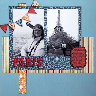
I finished my layout by stamping some more travelling words and 'splats' (to remind me of the drops of rain):