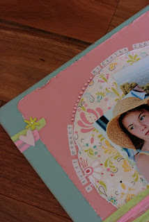
I thought I would take one of my projects or layouts and explain why I put that flower in just that spot, or why I chose to use ‘that’ particular color or why I added no mats to my photos.
It’s quite interesting when you start to dissect your work – or that of artists that you admire.
Pre-making pages with no photos.
I had this beautiful piece of cardstock and then picked out two of the colors on it to go with my project. I had some bling, chipboard and some paper ribbon with me – how could I not create something.
Now down to the creating of the layout. I did not have a sketch to work from but I really wanted to try using a large circle on my layout as i have seen how effective they can be. I created that by using a round dinner plate. I used my corner rounder on the other two square papers to give them a softness and follow with the roundedness of the circle. To give a little depth to the piece i distressed the edges of my papers.
 After layering all papers I adhered a couple of rows of the paper ribbon towards the bottom of the layout – making sure I ‘tied in the layers’ by running the ribbon across all layers. Being a pastel/girl layout i wanted to add a little sparkle so bling was added to the arc – mirroring it on the opposite side, top and bottom. At the top of the page I felt that it was not balanced as there was a lot of ‘open space’ so I added two small strips of the paper ribbon, a heart & a chipboard flower – this helped tie in with what was at the bottom of the page as I had no large titles on this layout.
Because I had no pictures at the time – I used two card blanks and popped them in the spots while I decided on placement for the chipboard pieces… sounds too easy doesn’t it. Bling was also added to the chipboard flowers to enhance the 'girly' look of the page.
After about a week I found some pictures that had similar colors as the printed paper and added them. A little journaling by using some small stickers and the layout was all done.
I have been creating a few layouts like this with left over papers and they sit ready for their photo which is usually within the next week or so.
You should give this a go – choose all your papers and embellishments and then wait for the photo to find its way to your layout. You can use this layout as a sketch if you like too.
We would love to see what you can create using this process. Why not pop it in the gallery.
http://www.scrapncraftwitht.com.au/gallery
Products included in this layout are:
Have a great week creatingWe would love to see what you can create using this process. Why not pop it in the gallery.
http://www.scrapncraftwitht.com.au/gallery
Products included in this layout are:
- Basic Grey - Urban Prairie
- Kaisercraft Bling
- Paper Raffia
- Carolee Creations Adornit tiny Alphas
- Chipboard Shapes
Tracey


1 comment:
What a fascinating process....I have NEVER created a LO without starting with the photo first....I love the idea that the right photo will turn up to complete it. I have held onto so many ideas and inspirations that come with the purchase of some lovely product that catches your eye, and inevitably never find the right photo to start the project. But I love the idea of doing things the opposite way around....it very much sits with the way I live my life...the 'act as though' principle, and everything you need falls in place....thanks Tracey....brilliant idea. I will definitely give this a go.
Post a Comment