I have a new blog!

If you want to see only my creations please come and check out and follow my new blog http://www.tanyah-payne.blogspot.com

Thursday, May 20, 2010

3rd Thursday Tips & Techniques - Buttons Glorious Buttons ...

Alison Calcott...
Since I was a little girl I’ve had a fascination with buttons. My Grandmother used to have this very old tin full of buttons she had collected over the years. Today my Mum has beautiful, big jars full of buttons. I guess with four sons and one daughter she had a lot of reasons to have a lot of buttons! My Mum also used to be a dressmaker so you can imagine the unique, delicious buttons she has that I’d love to get my hands on! As sad as it may seem (LOL) I often find myself checking buttons on garments prior to purchasing them just to ensure I will be able to recycle the buttons at some point further down the track.

I don’t know about too many others but something I do a little differently (?) with my buttons is to store them individually by colour groups. Not for me one big jar full of mixed colour buttons. I have containers (albeit much smaller ones than the old tin my Grandmother had and the big jars my Mum has) for each colour. I do this for three reasons. One, I inherited my Grandmother’s and Mum’s button fetish genes. Two, I find it so much easier if I want a yellow button to just grab the yellow container as opposed to hunting through a gazillion other buttons for that ‘just perfect’ yellow button. Third, the containers look so pretty all in a row.

Regrettably (?) that’s not where my dreams of buttons end. A long time ago when I bought a Big Shot (remember when that was first released?!) and a few basic shaped dies, I started making my own buttons ‘to order’ with raw chipboard combined with double-sided adhesive JAC paper and then pretty much whatever I had in my stash that I could lay my hands on. Here are a few I have ‘whipped up’ to share.

The above round buttons were made by adhering patterned paper (I had some Basic Grey Blush Collection scraps) to chipboard with JAC paper and then die-cutting some circles with my favourite die … Big Shot Thick Cuts Circles. In the top row you can see that the first button is simply the patterned paper with some sanding. The second button has also had Inkssentials Glossy Accents applied. On the bottom row the first button had Kaiser Pearls added before the Glossy Accents was applied. I added Kindy Glitz to the third button before the Glossy Accents (once the Kindy Glitz was dry). The third button is a combination of the Kaiser Pearls with Kindy Glitz and Glossy Accents.


The above harlequin shaped buttons are a shape I haven’t made before. I think they’re kind of cute. The one with the eyelets I want to make into a stick figure!!! Anyway, when making these buttons I didn’t use any JAC paper. The first button is raw chipboard with two eyelets set in the holes. For the second button I lightly inked the raw chipboard with a Tim Holtz Distress Ink and then used a Tim Holtz Stampers Anonymous Visual Artistry stamp and (of course!) another Tim Holtz Distress Ink to stamp text onto the button. The third button was painted and once completely dry, distressed with a sanding tool, whilst the fourth button was painted and had Glossy Accents applied. These buttons were made with a Cuttlebug die … Harlequin.


Finally, the above funky shaped buttons were made with chipboard, JAC paper, and a variety of textural elements. I enjoyed making these ones the most. Once I had die-cut the shapes with my Big Shot Thick Cuts Boxes, Funky die it was simply a matter of removing the top layer of the JAC paper to reveal the adhesive layer beneath. Then all I had to do was to stick them sticky side down into a variety of products, well kind of. For the first button I used a Pinkerrific We R Memory Keepers Foil Sheet as a rub-on (foil side down on the adhesive JAC paper) and ended up with this terrific metallic effect which shows the lines from when I did the rubbing. Pretty cool. Next up I used glitter to cover my button. I used a German Glitter made from real glass so needed to handle this one with care. For the third small button I used a Magenta We R Memory Keepers Flock Sheet exactly the same way I used the Foil Sheet, as a rub-on. This time though I didn’t get the rubbing lines.

Moving onto the three larger buttons. The one on the left I put in a plastic bag in which I store my loose Hot Pink Flocking and then ‘squished’ away. By putting the button into the bag with the flocking I didn’t have to worry about cleaning up any loose flocking afterwards. Plus I was able to get a fabulous application. The middle button was even more fun to create! I used the Bright Pink Flower Soft. Now anyone who has used Flower Soft knows that once you release the filaments from their original packaging that you need to then store them in a larger zip lock bag. Yes?

Well setting aside the buttons for just a moment … up until now I have been storing the empty Flower Soft containers in the bag so I knew what colours I was using. I discovered whilst making these buttons that in fact the labeling on the Flower Soft containers is actually an easily removable disc on the inside of the lid. So I removed the disc to pop into the bag and as a result ended up being able to store my Flower Soft in a smaller space plus I ended up with a really cool container for later use. For any storage junkies you’ll love this tip! So where were we? Oh that’s right … buttons.

I applied the Flower Soft to the large, middle button exactly the same way as I applied the loose Flocking. I put my sticky chipboard button in the bag and ‘squished’ away. You can see the result for yourself … one very funky, textural button that looks fabulous. Finally, as the German Glass Glitter I used on the small button needs to be handled with care, I decided to see how one would look if I applied Glossy Accents over the top of the glitter. Whilst it certainly alters the colour of the glitter, the end result is an ever so very cool, textured, plastic-like tile. I was so thrilled with the result (don’t we all hate glitter spreading all over our projects) that I’ve decided to do the same with my Flower Soft button and am currently awaiting the result. I will be sure to let you know!

As you can see, if you’d rather custom make your own buttons, the possibilities are endless. They are quick and easy to make, a great way of using up any scraps you have left over from your latest project, they look fabulous, and most importantly, they were made by YOU.

Alz :)

PS: Here is a photo of the Flower Soft button once the Glossy Accents had dried. Oh boy LOL, I think I’ve died and gone to Button Heaven!!! :)

PPS: I think next time I'll paint the button pink for a more polished effect! :)
---------------------------------------------------

Melinda Spinks... 
Buttons, Buttons, Buttons... come in all shapes, sizes and colours yet I will be the first to admit that I haven't really endeavoured to use them to their full potential. I have a tray of bits/bobs/buttons/bling beside me when I scrap and although it looks seriously amazing it is extremely underused and overstocked. So I took it upon myself to find new and interesting ways start using buttons in my work and I was amazed at how versatile a simple little button can be.
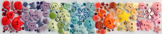
A button doesn't necessarily have to be for keeping your shirt from gaping or your pants from falling down, it can be used to embellish, enhance, add colour, add dimension... you are only limited by your imagination.
Try adding multiple buttons in the one colour scheme and overlapping them to create great dimension and an interesting statement on your project...
One of the latest trends seems to be that of adding just a simple bow to your button which looks really cute and is an alternative method in attaching a button to your layouts or cards...
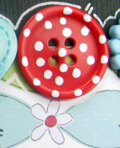
Ever thought of grabbing a paint pen and adding some extra pizzaz to your button collection...
So I think it is time to have a little wander through your supplies and you may be pleasantly surprised at the collection you have built up over the years. Why not re-evaluate the way your buttons are stored, try separating them into individual colour schemes. I find buttons look so vibrant when they are individually sorted into their own colours and it makes life a whole lot easier to find a match for your project.
Next time you are looking for that perfect embellishment... try a button!
-----------------------------------------------------------------
Tanyah Payne...
 Buttons can be of all shapes and sizes, hand made as you can see above posts.
At scrap in craft with T. we stock....
Chellebean Buttons which are adorable... check more of them out HERE


We also stock packs of small buttons which are fantastic value...

 
We also have glittered buttons which look fantastic for placing in a garden pages and so much more.
Thankyou girls for your ideas with this one, i really apprecate it and I am sure our readers love your ideas...

thanks for reading
enjoy your day
luv tanXx


Wednesday, May 19, 2010

Using up your stash with tips & Techniques - By Alison Callcott


Tips/Techniques
*   When using bold sections of patterned papers, using papers from the same range will help them blend and contrast more effectively.
*   Paint and sand your embellishments to help them stand out against the bold patterned paper.
*   Keeping your paint and embellishment palette confined to just a few co-ordinating colours will prevent the LO from appearing over done.
*   Twill is a great alternative to ribbon when creating a heavily distressed looking LO.
*   Create your own ‘dictionary definitions’ for the words you want.  Printing them on acetate enables them to be layered over other elements, in this instance the photo.


Friends
*   Crate Paper Samantha Collection
*   Cardstock – red and teal
*   Maya Road chipboard alphas
*   Fancy Pants chipboard
*   FolkArt acrylic paints
*   Acetate
*   Making Memories staples – dark
*   Brads - red
*   Twill
*   Decorative edge scissors

Tuesday, May 18, 2010

One of our Design Team members  Lisa kamphuis  has been published 3 times in the last Scrapbooking Creations Magazine.... we are very proud of you lisa, they are amazing layouts and I can see why they have been published Lisa


Here they are for you to have a peek...

This one is a full page and on page 99


On page 48  you will find this adorable little girl of lisa's.....

and her amazing boys are on page  64.


Congrats Lisa and well done! amazing layouts and love everything about them.!


till next time
luv tanXx

Monday, May 17, 2010

THE THOUGHT BEHIND THE PROCESS

We gather information everywhere and store it in our head space for use later down the track. We call on it each time we set about to create a layout, Off the page item or mixed media project. Inspiration comes from looking at each others work, through magazines, movies & tv, a color scheme that you have seen on a paint chip, a department store display - there are so many.

"One Cool Dude" is a layout that I created after seeing something similar from an American artist online a few years ago. I wanted to create a type of retro color scheme so i found inspiration from the early seventies for this part of the layout.


The layout that I admired used round circles of the same size. I decided to use squares in varying sizes instead. The photo they had used was a lot smaller and this was such a cute photo I really wanted to accentuate that so I had it enlarged.

My background paper was a brown tone so that it would tie in with the color of the skin and to keep the focus on all the little squares of patterned paper & their beautiful hues. I chose around 6 printed papers and two plain papers, some prints were double sided. I then cut them into varying strips in readiness to be cut into different sized squares.

The photo was prepped by cutting the excess background away... this gave it a kind of 'three' dimensional look on the page. I chose three different chipboard fonts and prepared them by giving them an undercoat and then two coats of paint. once they were dry I used my black pen to outline the outer edges to help give definition to their shape.

So all the prep work had been done - now to start adhering the elements to the page. I started with my photograph. I then placed different shaped squares across the page, slowly going up the page and around the face. I did not stick them down until i was happy with their color placement. I tried to use some small solid colour blocks to balance out all the prints. Once I was happy i then adhered them to the layout. I then accented all the boxes with a black outline.

I added the title by staggering it across the page and added some small tags from the Heidi Swapp range and the Making Memories range. The outer edge was painted with black paint to help give the layout a border.

This is a great layout for you to use up all your scraps. I tend to have lots of left over strips - organising them in color groups is great if you are looking to put together a quick and simple, stand out layout with a large photo that you can cut out.

I hope you have fun creating this layout - I can see myself making a few more of these maybe even with some other shapes.

Have a great week
tracey

Sunday, May 16, 2010

Step by Step single layout by Lisa Kamphuis

 Lisa has created a very quick layout for you all to have a go at!....


1.  Using a white cardstock  background and a strip of  bright  coloured paper

2.  I have  glimmer misted mine for some additional  colour and sparkle
3.Trim a series of photos  to fit across the  page.  Its a  great look if they  tell a story too
4.  Add some  simple embellishments and a title.  I have heat  embossed a  chipboard title for this one

5.  Add any  journalling or   final  touches you may like..
Isn't this adorable!.... looks fantastic and thanks for sharing lisa
luv tanXx

Saturday, May 15, 2010

Saturday Scrapping Stimulus...

Wow, is it really mid-May already? Where on earth did this year go? We'll be talking about Christmas and New Year before we know it...

The quote I have chosen today is one I have chosen because I'm planning on using it for a page about my younger brother. He's homeschooled by my mum and would prefer to spend his time "inventing" than actually doing his Maths or English...

********
An inventor is simply a fellow who doesn’t take his education too seriously.
—Charles F. Kettering

********
It's particularly relevant to Ryan, but I can just see it being used on a page about any young inventor, or even any older inventors out there!

Have a wonderfully happy scrappy weekend!

Kylie

Friday, May 14, 2010

I'll show you mine ... if you show me yours

Let's face it. All of us who scrap had to start somewhere. Often you can find our first ever LOs hidden away in the back of albums. Where's yours stored? Mine? It's the first page (I didn't know it at the time but its actually a 'title page') in my dog Hayley's album. Hayley's unexpected passing was the impetus for me to start scrapping. What got you started?
I quite like my first ever page. I still to this day think its rather good LOL! Perhaps because I had been involved in paper crafts and other art based crafts for several years I felt comfortable working with various mediums? Maybe because I had been doing stamping based cards for many years I was more aware of some of the different products on the market (at the time) and how to use them? Sentiment maybe? Because it was ‘my first’ … sort of how we remember our many other ‘firsts’? Could it be that it represents a complete change in my life path and subsequent lifestyle and dreams? It could be all of these and more. I just think I like it. How do you feel about your first ever LO?

The truth is that the next several LOs after that first one kind of make me cringe LOL! Each of them looks as if they were created by a different personality (oh and I promise you I only have the one!)!! I plan to re-organise my albums one of these days (LOL where have I heard that one before??) and you can bet on it that some of those earlier pages won’t be featured as prominently as they perhaps are at the moment. But then maybe I should leave them in the order in which I created them? Scrapping is about telling a story yes? Well then, doesn’t each of our pages tell a story about our scrapping journey and us? The times we tried different styles or products and found that really they weren’t for us? Or the LO that shows when we first started heading in a different direction? In fact they could be considered examples of the trends and fashions of the time they were created. Five years ago I’m not sure there were too many ‘mainstream’ scrappers using recycled materials from their recycling bins on their LOs. Today? Well it’s almost the norm. Heh maybe one day those earlier pages will come back into fashion?


Okay so hmm … if I show you mine will you show me yours? I hope so. Here’s mine …
I don’t have a record of the products I used but from memory I can tell you that the foam alpha stamps (Li’l Davis maybe??) for the title were intended (in those days) for use with paint but that being a stamper, I used ink. I remember how hard it was to find nice (well any really) pet themed paper and so I created my own background with Bazzill cardstock and a piece of black milliner's sinamay. I didn’t know to matt my photo as I didn’t actually do any scrapbooking classes, so I went to great lengths to make a frame for my photo. Being so used to using ‘phrases’ and ‘sentiments’ for my cards I made up a ‘little poem’ for my journaling; but heh at least I included journaling!! I used my favourite paw print stamp to make my own patterned paper. My ribbon wouldn’t stick to the cardstock through the milliner's sinamay despite using double-sided tape so I secured it with brads. All in all not a bad effort for September 2005 I’d say LOL!


Now that I’ve shown you mine, I’d love for you to share some of your first time creations with us in the gallery. For those of us insecure about those first pages, let’s stand tall and proud and celebrate their true meaning … our first steps into the world of scrapbooking. Alz :)

Thursday, May 13, 2010

Making your own background Paper - Chromatography Technique

Here is a Technique That Di Hasthorpe shared with us last friday night for our technque fun nite... it is so cool....
 
The technique of water soaking through the soluble colours is called chromatography. This is the technique of finding out what colours or pigments are in a particular shade of colour.eg, in purple, you would expect red and blue colours to appear when the water soaks through. 
 
 
Here is a layout created by Di Hasthorpe using the finished pattern paper!....


Step 1
First we started with White mulbery paper... 


Step 2
We then placed water coloured/die based inks on the Mulbery paper. We have used Distressed inks.
Step 3
We folded it into a cone shape and placed in a tall cup of water. We only had a small amount of water at the bottom 
Step 4
We then watched the colours move towards the edge of the mulbery paper
 
Step 5
Then we pulled it out and had a look
Step 6
we wanted it to go to the edge so we placed it on a mat and socked it some more
We decided it needed more colour in the middle so we placed some distressed inks in the centre. 
step 7 
Then its the waiting game and wait for it to dry. This will take a while depending on how wet your paper is...
 
Step 8
Here is the finished paper... you will find one side is brighter than the other.


I hope to make a layout using this paper so you can see a layout can be made out of just about anything....
 
 
Here is a Di's layout  she created using my photo of my daughter and niece Beth. Di has used the above altered mulbery paper to create this stunning layout.
 
 Other products used are....

  • Cardstock

  • fancy pants paper

  • funamentals alphas

  • Green tara flowers

  • pearls

  • bella flocked accetate

  • a2z scraplets

  • clear swirl stickers

  • Yo yo heart made by Nic Amber

  • paper string

  • Mesh ribbon

  • 1cm roses 
    Thanks so much for doing this di, this is unreal! xx
Our Friday Nights are so much fun but this week the 14th of May we are CLOSED due to me going to a retreat at Ashmore!
Next week if your able to make it I am sure you will have fun learning new things and having lots of fun!
till next time
luv tanXx

Wednesday, May 12, 2010

Using up your stash with tips & Techniques - By Alison Callcott

True Colours
*   Basic Grey Urban Prairie Collection
*   Basic Grey Chip Stickers
*   American Crafts Thickers – vinyl blue – rootbeer float
*   Imaginisce blossoms
*   Buttons
*   Tim Holtz Distress Ink – worn lipstick
*   Aqualip pen – black
*   Inkssentials Opaque white pen
*   Font – American Typewriter


Tips/techniques

*   Use a template to lightly draw a border around your LO in pencil and then go over it with pen.  Once completely dry, carefully erase any pencil marks still showing.
*   Doodling with more than one colour creates visual interest.
*   Working with products from the one range (in this case Basic Grey Urban Prairie) makes it easy to have a perfectly co-ordinated LO.
*   When using buttons as flower centres, try using the same colour button as the flower for a subtle effect.
*   Don’t hesitate to add items to your photo for visual interest ... on this LO I added a flower to the photo so that it looked as though my subject had a flower tucked behind her ear.


Thanks alz for a fantastic layout and wonderful ideas....

luv tanXx

Tuesday, May 11, 2010

Crate Paper Kit by Melinda Spinks

KIT CONTAINS:
4 x Cardstock
1 x Crate Paper 'Paper Doll' Patterned Paper
1 x Crate Paper 'Paper Doll' Chipboard Accents
1 x Large Flower
1 x length of string

EXTRA PRODUCTS REQUIRED:
2 x Photos (6x4 vertical)
Journal Pen
Border punch
Dimensional Magic
Adhesives and Foam Tape

 SINGLE PAGE LAYOUT
STEP 1.

Using the Aqua card stock cut a strip 24cm wide x 4cm deep and alter the bottom edge... I have used a scallop border punch but you can use anything you like. Adhere to the cream card stock approximately 2cm up from the bottom of the card and spaced evenly each side.
STEP 2.
Using the 'Peyton Ellie' Patterned Paper cut a strip across the bottom of the paper to incorporate the red line measuring 24cm wide x 3cm deep and adhere to the layout overlapping the aqua card stock as shown. Cut a further piece of the Peyton Ellie measuring 24cm wide x 20cm deep and adhere to the layout 2cm down from the top of the layout and centred each side.
STEP 3.
Using the brown card stock cut a rectangle measuring 21.5cm wide x 16.5cm deep and adhere to the layout 5mm up from the bottom of 'Peyton Ellie' printed paper and centred either side.
STEP 4.
Cut another rectangle from the aqua card stock measuring 21cm wide x 16cm deep and adhere to the layout centred on all four sides within the brown card stock.
STEP 5.
Adhere your two photos over the aqua card stock.
STEP 7.
Adhere the large pink paper flower to the layout as shown below. Using adhesive foam to give a raised appearance position the "Little Girls are a gift" die-cut centred over the flower. Also using adhesive foam position the 'precious' die-cut to the left of the pink flower as shown below.  You ca also place a couple of the smaller die-cut flowers over the top right corner of the 'Little Girls are a gift' tag, again using foam tape. Cut in half the brown/white/aqua pin wheel flower and using double sided tape only, adhere to the layout as shown. 
STEP 8.
Using a brown journal pen handwrite your journalling in the cream strip between the two pieces of patterned paper. Also using the brown pen doodle a little dot on each of the scallop joins right across the aqua strip on the bottom of the layout.
STEP 9.
Cut three little triangular nicks out of the card stock approximately 1cm apart from each other on each side of the layout - these nicks only need to be small as they are going to hold the string in place once you wrap it around the back of the layout. Using three equal lengths of string place one across the layout and align with the two top nicks and turn the layout over and tape the ends of the string down. Repeat with the next piece of string moving down to the middle set of nicks and then the final piece of string in the bottom two nicks. Slide a small piece of double sided tape under the string where the die-cut button will sit and gather the three pieces of string together and adhere to the cardstock. Tie a string bow through the holes of the button. Place the button over the gathered join and using foam adhesive tape to give the raised appearence adhere the die-cut button to the layout. Lastly, place a drop of dimensional magic on each of the hand doodled dots across the bottom of the aqua strip and leave to dry, this will create an effect similar to a small rhinestone! You can also put dimensional magic on the die-cut flowers as enhancements.

SINGLE PAGE LAYOUT No. 2
Extra products required:
- One 5 x 7 pic (Portrait orientation)
- Dimensional Magic or Glossy Accents
STEP 1.
Adhere your 5x7 portrait shaped pic to the centre of the layout. Cut 2 strips of paper 3cm wide x 18cm deep from the patterned paper (floral side up) and 1 strip each of the aqua and brown card stock. Adhere one of the floral paper strips to the left of the photograph leaving approx a 3mm gap between the paper and the pic.
PAPER ROLLS: Using the remaining three strips of paper you will need to turn over onto the reverse side and draw a ruled line down the middle of the strip (from top to bottom) which will form your cutting guide. Still using the reverse side of the strips you need to 'fringe cut' 5mm wide tabs all the way along the left hand edge, not cutting past your centre line. These tabs form the little rolls. Place a strip of double sided tape along the back of each strip on the non-cut edge. Turn the strips over and adhere to the layout starting with the brown strip, then place the aqua strip over the brown leaving the pre-cut tabs comletely visible, and repeat with the patterned paper strip which should be 3mm away from the pic.
You will need a quilling tool or tooth pick to make your rolls. Have your layout facing you with the brown strip closest to you and starting from the left hand side of the patterned paper strip roll the first tab away from you. The next tab should be rolled toward you and continue until you get to the end. Repeat with the aqua strip followed by the brown strip.

STEP 2:
Using the die-cut shapes cut the large lime and aqua flower in half and adhere flat to the layout as shown below. Now you can use foam adhesive tape to adhere your title and the large pink/red flower as shown.

STEP 3:
You need to cut three different size circles using the same papers as the strips. The aqua circle should be approximately 8cm across, the brown circle approximately 6cm across and the patterned paper circle approximately 4cm across. Scrunch each circle up into a little ball to give it the 'wrinkled' effect, then un-scrunch them and place them one on top of the other from largest to smallest. Poke two holes in the centre and tie a string bow to hold them together. 
Also cut two leaf shapes from the aqua card stock and using a white journal pen draw on some leaf lines and then fold a crease down the centre of each leaf.

 Adhere the flower and the leaves to the layout and add some of the remaining die-cut pieces to fill in some of the gaps.
STEP 4.
Using a journal pen in either brown or black, write your journalling below the pic as shown below. Once you have completed all the steps you can use dimensional magic or glossy accents to pick out pieces of your layout and give them a little more dimension!
Once the two layouts are complete you still should have enough bits and pieces left to make atleast one card if not two.
I really hope you enjoy your kit!
Happy Scrapping!
Melinda

Monday, May 10, 2010

THE THOUGHT BEHIND THE PROCESS

I hope you have all had a fantastic Mothers' Day weekend. Spending time with family is one of the most rewarding things that we do - it shows the love and thought and caring we all have for our family and one another. 

My layout today is a page from my 52 week Journal for 2010 that I am creating over on the ScrapChat website.
This one is titled Family and I think it is very fitting for this week as we all discuss what a fabulous time we have had over the past weekend.

Sometimes I truly ask myself what I was thinking when i put together a page. This one is no exception - I love how it has turned out, and I did not plan any of it - it just evolved.

I started with my blank cardstock and had my photo picked out. Because the photograph is black and white it gave me so many options to choose the colors to compliment it, so I picked some of my favourite color combinations - red, aqua, lime.  With all these pages that I have been creating I really love the texture that I have added, the dimension cannot be duplicated even if i did this again, so my project is totally original each time. 

Firstly I had some tissue paper on my desk so I decided to coat my cardstock in glue and then added the tissue paper - folding and crinkling as i stuck it down. Yes it looked messy and unorthodox but then i found some fabric... and not any fabric -- it was heavily textured and worked well on the red tissue paper - on it went.

I then decided it was time to add the picture before i took to the layout with my sewing machine. When I approached the sewing machine it was laden with some very lush lime green rayon cotton... what a perfect color to introduce into this artwork I thought to myself. Because my layout was about family I thought it was fitting that i framed us all in a big heart - so many layers of stitching later i had created my border.

After the stitching I added some red mesh. I printed out my journalling and added lime watercolors to it as well as the tag on the left top of the page. The journalling was then sewn onto the layout and the tag was stapled on. I felt that the tag lacked something so i added some more red by introducing the heart and a making memories metal embellishment.

The title was added in a making memories label holder and a we are memory keepers lime swirl deco eyelet was added. At this stage it still needed more .... i was wracking my brain.... I felt I needed to introduce black because of the colors in the photograph so a black flourish rub on was added to the right bottom. The layout still needed a little more - so I added some lime green beads with dimensional magic. These i added a little over the flourish and up the stitching to help tie in the photograph with the journalling.

So that is my takedown of this layout. I hope you like it and I truly hope that you can have the courage to just have a go - set yourself no rules, have no boundaries, and create with what is in front of you and go with the flow.

Enjoy your week creating
tracey

Sunday, May 9, 2010

Scrap N Craft with T 2010 'Embellish it' MAJOR YEARLY COMPETITION

Our Scrap N Craft with T MAJOR YEARLY COMP has come around again! It was so popular last year we thought we would give it a go this year and hope to make it bigger and better. We have 2 parts this year, so please read carefully.

To register by the 6th of June please ....
  1. email your full name and gallery name to: admin@scrapncraftwitht.com.au We also need to know which competition you would like to be a part of (see details below).
  2. register in the gallery: www.scrapncraftwitht.com.au/gallery
  3. register in our shop: www.scrapncraftwitht.com.au

'EMBELLISH IT' COMPETITION...
  1. Will run for nine (9) weeks starting with the first challenge on Friday the 11 th of June at 12 midday AEST.
  2. ALL challenge entries will need to be put up in the Scrap N Craft with T Gallery by the following Wednesday, ready for our lovely Design Team girls to judge.
  3. Only one entry per person. Your first entry for the week is the one that will count regardless of if you have or have not met the criteria.
  4. No step by step photos allowed please. If you would like to do this please email us and we can do a separate blog post in a future week.
  5. Everyone will need to register to participate. This is to be done in the gallery and shop. You will also need to email me with your gallery name and real name to make it easier to work out who has won the prizes.
  6. Each Design Team member will provide 5 points that each week's criteria for their project will be judged on. This will change every week due to different projects that the Design Team member will do.
  7. There will be weekly prize of a $20 voucher to the week's winning entry plus a Design Team gift.
  8. The overall winner will receive a $100 voucher and $50 of goodies included in their order with a total of $150 for the winner. Second place will receive a $75 voucher and third place will win a $50 voucher.
  9. There are permanent Design Team positions up for grabs but this is optional if you accept.
  10. This year we are offering everyone who enters our competition and completes their weekly entries (in both the main competition and challenge section) a 10% discount in the shop. If you fail to create an entry for a week, your 10% discount ends.

Challenge Section

If you don't want to be elimated and want to just feel challenged and want to extend your skills, than this is for you!
  1. This is just for fun.
  2. There will be the same challenges as the above competition challenges
  3. If all criteria isn’t met it will not matter.
  4. There will be no judging of your work. Entering each week is the fun part, and will keep you in the running!
  5. At the end of the ninth week, we will have a first and second prize that will be picked by Tanyah Payne (owner).
  6. All eliminated entrants of the main competition are allowed to enter and be part of this challenge and be in the draw to win the first prize of $40 and second prize of $25.

hope to hear from you all soon
enjoy
luv tanXx

Saturday, May 8, 2010

Saturday Scrapping Stimulus...

Welcome to another weekend full of *hopefully* creative promise!

I liked today's quote because of the fact it's fairly short (therefore less alpha stickers used up! LOL), it's kinda funny, and it tells you to get up off your butt and DO something! I certainly need that reminder sometimes!

********

"Even if you’re on the right track, you’ll get run over if you just sit there."
~Will Rogers

********

I hope you get a chance to express yourself creatively this weekend, even if it's only in a small way...

Kylie