I have a new blog!

If you want to see only my creations please come and check out and follow my new blog http://www.tanyah-payne.blogspot.com

Wednesday, March 31, 2010

Crate Paper Kit

Tanyah asked me to see if I could come up with a kit for $5 - well I tried very hard but went over budget a little, however I have managed to make two layouts and a card for not much more. Sometimes patterned papers can be enough to create wonderful layouts without using embellishments, throw in a packet of co-ordinating chipboard shapes and you are away. The Crate Paper 'Paper Doll' collection is just beautiful, very pink, very girly, however, you don't have to limit yourself to just the little girls, it is still suitable for the olders girls.

Kit contains:
  • 2 x pale card stock
  • 1 x Double Sided Patterned Paper
  • 1 x Sheet of Chipboard Shapes

Products Required from home:
  • Layout 1: Four 3" x 2" photographs
  • Layout 2: One 6" x 4" photograph
  • Dimensional Magic
  • Adhesives
  • Journal Pen
  • White and Brown card stock for card
  • Sentiment for card
Sweetie - Layout 1:

Step 1.
Take your sheet of patterned paper and cut it into two halves and put aside one of the halves for another layout. Next, cut a 2cm strip off the top of your remaining half and put it aside. Now cut 1cm off the right hand side of your patterned paper and discard.
Step 2. 
Place a selection of the chipboard shapes across the bottom half of your patterned paper in the order that you would like them (do not stick down). Carefully draw a line around the top of the shapes leaving approximately a 5mm gap between the chipboard and your paper. 
Step 3.
Remove the chipboard shapes from your patterned paper and set aside. Now you can cut around the patterned paper being careful not to cut off the doodled line as this will remain on your paper as a feature. Using your pink card stock as your layout base, adhere the patterned paper to the top of the card leaving approximately 5mm border around each side and continue to doodle around the remaining three straight edges.
 
Time to adhere your chipboard shapes - using different thickness mounting tape to give a layered effect. You can also use some dimensional magic/glossy accents to highlight parts of the chipboard shapes.
Step 4.
Now you can adhere your photos across the cardstock, I have trimmed mine down slightly to allow for evenly spaced gaps between each photo.
 Step 5.
Using your 2cm strip of patterned paper, turn it over to the opposite side and doodle around it. I have used a Fiskars scallop border punch on one edge of mine as well as the doodling. I have also added dots of dimensional magic/glossy accents across the paper strip for enhancement. Adhere the strip to the card stock approximately 3cm below the bottom of the photographs which leaves you enough room for your journalling. Place a few more of the chipboard pieces to the side of your strip and again use varying thicknesses of foam mounting tape to stagger the height for a layered effect. You can also decorate the chipboard with the dimensional magic/glossy accents.

Step 7.
Lastly, it's time to journal in the remaining gap between the photos and the strip of patterned paper.


Little Princess - Layout 2:

Step 1.
Using the remaining half of your patterned paper cut three strips and a heart shape.
  • Strip 1 (pink side up) 21cm x 4cm
  • Strip 2 (pink side up) 20cm x 2cm
  • Strip 3 (green side up) 19cm x 5cm
  • Heart (hand drawn) 9cm tall x 9cm side
You can doodle around the edges or ink and distress them. I have used the Fiskars scallop border punch on the smaller pink strip.
Step 2.
Using your white card stock as the layout background, adhere the strips and heart as shown.
Step 3.
Adhere your photograph over the overlapping both the green strip and the heart.
Step 4.
Position the remaining (except the little doll which needs to be saved for the card) chipboard pieces onto the layout and use variable thicknesses of adhesive foam tape to stagger the height and give dimension to your layout. Again I have added dimensional magic/glossy accents to some of my chipboard to enhance the pieces. Place your 'Little Princess' title piece overlapping the photograph and journal below it.


Happy Birthday Card:
This sweet little card was made using the very last chipboard piece which I'd saved because it was just too darn cute! I also used the last strip of the patterned paper, some spare brown and white card stock in my stash and another stash item being the birthday sentiment rub-on.

Step 1.
Cut and fold your brown cardstock into the size card you require. Cut a piece of white card stock the same width but 1cm smaller in height and adhere it to the brown cardstock leaving a 5mm gap top and bottom.
Step 2.
Using the very bottom strip of the patterned paper where it has both the green and the pink together, cut it down to go across the length of your card and then doodle around the edges. Again I have used the Fiskars border punch and doodled the scallops and little dots then covered the dots in dimensional magic/glossy accents.
Step 3.
Adhere the little doll chipboard piece using thick foam tape to raise it off the card for extra dimension.
Step 4.
Place your sentiment just above the patterned paper strip, I used a random 'happy birthday to you' rub-on that I had in my stash.

I hope you enjoy this wonderful, simple and very inexpensive kit!
Happy Scrapping...
Melinda


Cardstock Shaped Album....fun for everyone to do!

I made made a mini album for my mother in law and my neice saw it and all she wanted was one for her birthday.....and when it was mine she returned one she had made for me... ( I will show you this one later)

This is an easy project for all ages to have a go at


All you need...
  • Cardstock
  • flowers
  • bling
  • ribbon 


Step one...
Work out what shapes you want to work with and what size


Step two...
These circle shapes were used for the back page of the album for the tree.


Step three...
Decorate your first page


Step four...
Decorage the back


Step five...
Decorate the sun, I had doodled on this side before placing any photos down


Step six
Decorate the back of the sun.
 Step seven
Decorate the flower...

Step eight
Decorate the back of the flower


Step nine...
Decorate the tree


Combine with a album ring and all done!....

hope you feel inspired to make one of these as a gift for someone special...

enjoy your Wednesday and thanks for poping in
luv tanXx

Tuesday, March 30, 2010

Happy 12th Birthday to our Katie & Retreat Reminder....

Today our Katie is 12 and we want to wish her a happy birthday. Her day will started off with getting a lovely gift from her Aunty Jodie. All she wants is for her ears to be peiced so this is going to happen at 9am... she is sooo excited. Today apparently they are having a classroom party that just so happens to be on her birthday. So one hypo child for dancing today i think...lol!

Tonight katies request for tea is Lasagne...yummy! think it was interesting she never wanted McDonolds...lol. She loves healthy food this girl!

***********************************************
Also a retreat reminder...


 If you want the chance to pay the early bird price for the retreat you have 2 days to do this!...

This price closes on the 1 April and the price of the retreat will then be $175 after this date.

We now have 9 places left so book in quick if you don't want to miss out!... you will be assured to have lots of fun and inspiration.


To book your spot so you don't miss out.... CLICK HERE!..


hope everyone has a wonderful day
luv tanXx

Monday, March 29, 2010

THE THOUGHT BEHIND THE PROCESS

PHOTOS - lots of them......

One weekend last year I decided that I would tackle that box of toddler photos I had of my children. I had been  putting it off every time I walked past them. I needed to be brave - open the box - grab a bundle and just scrap them.

I take lots of photos in a series- i guess its the thought of missing the perfect shot, so when grabbing this particular bundle there were quite a lot of pics that I wanted to use on the one layout. Most of my older photographs are bundled into lots ready for me to scrap.I was creating a lot of layouts that weekend and decided that most of them would be one page layouts.

When we take pictures and we don't use an editing program before printing there is a lot of unnecessary background that is not needed, i had a lot of that in the following pics. All i can say is CROP... yes just cut that out ... you find that most of the time you have centered your picture and the stuff on the sides is extra ,so just cut that out as its really not needed.

Oh i almost forgot here are two of the layouts that i created over that weekend...

Layout 1 ---5 picture layout

Layout 2 --- 6 picture layout

With each set of photos I chose my papers to suit and because I was scrapping a lot of photos onto one page I really needed to crop them to make sure that i could fit them all on the page. Also I needed to make sure that I had sufficient space to add a title and journaling if I wanted to add it.

On Layout one I have added journalling with a text block.I printed the journalling from the my computer and mounted it on a contrasting cardstock before adhering it to the layout. I have added photo corners to the larger photos  which were placed so that they have created a nice squared off effect on the layout. Then as with the second layout I have tied it all together by drawing a border around the layout tying all pics together. On Layout one I have used rub ons with themed sayings which i felt have tied in with my feelings and thoughts of the photos and journalling.

Layout 2 - well tub time was and still is the fun time for my beautiful daughter, as a pre - teen now -- oh my gosh, they take so long in the bathroom... some things never change. I decided that i would not journal on this layout,  unlike the first layout it had no title only journalling and rub ons to tell the story - with this layout i am relying totally on the title, and you can see it is 'tub time'. The photos can tell the story. I have used photo corners again on this layout but they are on the corner of the page and a border line has tied all the photos together as well. To create the title i have used a few different Alphas - the word tub was created using a mixture of stickers and chipboard letters and time was created using Bella alphas.

Sometimes i feel that there is no need for journalling, there is a sense from all the photos that you can tell what is going on unless you want to point out something in particular with what your are scrapbooking. If there is a story behind those photos - then it is okay not to journal.... the photo can tell the story for you, but if the story is too good to keep to yourself... then journal about it .. its great for the family to have a read and a recap on the fun that was had while taking those photos.

till next time -- have fun scrapping
tracey

Sunday, March 28, 2010

Sunday Gallery Spotlight is ....Gillian Lester

Well Sunday has come around very quickly again and time for me to choose another amazing layout out of our inspiring Gallery. I love what I am seeing and love seeing new layouts that are being uploaded.

The girls doing the Born2Create Challenge, your work is incredible and it is going to be fun for Chris to decide who the winner....is

My Blog challenge has 3 fantastic entries this month. We have a couple of days to go before this month is over if you want to have a go. See on the right hand side of our blog for details. Upload your layout under the challenge section please stating March blog challenge.

Now today’s spotlight is on Gilly -  (Gillian Lester).... wow your work is amazing and thankyou so much for sharing it with us

If you want to see more of Gilly's creative work check out her blog HERE!..


I really love how you have used knitting needles, wool, tape for this page it is a very clever idea and love what you have done!
Thank you Gilly for sharing your beautiful work in our gallery.


Till next time and thanks for poping in 
luv tanXx

Saturday, March 27, 2010

Saturday Scrapping Stimulus...

I love Shakespeare. While most teenagers dreaded studying his works, I memorised them and loved them! So this week I found inspiration in his works...


"It is not in the stars to hold our destiny but in ourselves."
~Shakespeare

A great reminder that we are the rulers of our lives, not outside influences.

Hope you have a great creative weekend!

Friday, March 26, 2010

Handmade flowers with a twist by Ingeborg Dijkstra

These two cards both feature a large handmade flower. They are made in exactly the same way, but look quite different, since one is made from plain paper and the other one from patterned paper. These are truly flowers with a twist!

A while ago I saw a tutorial about making paper flowers using border punches and a paper crimper. I wish I had saved the link, so I could give proper credit, but unfortunately I didn't, so I cannot tell you exactly where I saw a similar idea.

So what do you need to make these flowers:

  • a border punch (I used the Fiskars Effervescent punch, but most border punches would look good)
  • a paper crimper
  • strips of plain and patterned paper (about 12" long and 3/4 inch wide, but you can vary this too to suit the shape of your flower)
  • a circle punch (I used 1 1/2 inch, but again, use a bigger circle for bigger flowers and smaller circles for smaller flowers)

I cut a few strips of paper. It is important to not use cardstock (that won't work well) or thicker patterned paper. I used fairly thin paper to get the best results (picture 1). Using my border punch I punched a border on all my strips (picture 2). To create 'folds' and texture, I used my paper crimper (picture 3). I punched a circle out of cardstock (I used 1 1/2 inch) and I added a layer of glue on it (picture 4).

Now for the sticky and twist part: I held the strip of paper with one thumb, while twisting and folding the rest of the strip around the circle. If you have a bit left at the end, just cut it off (picture 5). I held it for a while to make sure the outer circle was truly dried (picture 6). I added a second strip (picture 7) and a third strip (picture 8).


I added a little rose in the middle of the flower to make it look like this:

Using the patterned paper strips the flower looks like this:


These flowers are very versatile and by changing the size of the strips, circles and punches the possibilities are endless! These are two cards I have made using the plain and the patterned flowers:

Thursday, March 25, 2010

LOOK what we have 'NEW' from BO BUNNY!!!

We have just uploaded 3 new Bo bunny ranges... you will love these for sure! we expect these to arrive tomorrow or monday at the latest. Pre-orders will be packed first.


 Please remember this is a new line of products and coupons won't apply with these ranges until August 2010

CLICK HERE TO PUCHASE THE SOPHIE COLLECTION....


This range is fantastic for us camera lovers and family who seem to have the camera where ever they go!...
This is one beautiful range.... Their are many times I have people asking me for a purple range...well here it is with extra bling. A delightful range and I can see lots of amazing projects created with this range.
Come and check it all out! you won't be disapointed
enjoy shopping
luv tanXx
www.scrapncraftwitht.com.au

Tuesday, March 23, 2010

Layout by Sarah Rickard and a sketch by Kylie Abel

With Lisa using the Pink Paisley - Cupid range of pattern papers for her kits this month  (we will have another kit for you to purchase next week) ... Sarah has also been road testing these papers too.


Notice the fine detail in this layout... the doodling around the edge of the bracket shape, zig zag sewing on the left side .. all to create something indiviual and unique.


This layout is awesome sarah and thanks for sharing with us.

Products Sarah has used are:
I would like to thank kylie for doing this amazing sketch - for us all to enjoy!
Hope you have a go at this sketch and place in our gallery!....
We love it when you SHARE IDEAS and YOUR CREATIVE LAYOUTS....

till next time
luv TanXx

Layout by Alison Callcott and a Sketch by Tanyah Payne

Hi everyone

It has been a while since i did a sketch for inspiration and thought i would do one for today. I have used several digi elements from lots of places eg yillup designs, pickleberrypop etc.

With Sketches they are only a guide for inspiration, something in this sketch may twigger some sort of idea that you will grow from and create your own master peices.

We would love to see what you create in our gallery.. www.scrapncraftwitht.com.au/gallery.

Here is the sketch....


Here is Alisons amazing layout to share with you all....


Notice the different colours in the layout to the sketch... Also using flowers instead of butterflies. change the sketch to suit your photos and what you would like to create.

Enjoy your day and happy creating
luv tanXx

Monday, March 22, 2010

March Digital Freebie - Vintage Elegance Part 4

Well, you FINALLY have the whole kit as of this week...

Welcome to the fourth week of the Vintage Elegance March digital freebie. I hope you enjoy creating with it as much as I have enjoyed making it!

You can pick up week 4 from HERE.

Now that you have the whole kit, you have no excuses not to let us have a peek at what you've created with it! Head on down to the GALLERY to let us have a look at your creativeness...

As promised, here are the whole month's worth of links in one spot...

WEEK 1
WEEK 2
WEEK 3
WEEK 4

Thanks for joining in!

THOUGHT BEHIND THE PROCESS

Today I thought I would venture into the topic of cutting up your photos and using them on a page to make your layout come alive.

I like to print a lot of my photos and its great how I get to choose their size. Sometimes when I have printed them I realise i did not want an element that may have been present, this is usually when I decided that i will cut my photo up and create a feature with it on my layout or i strategically place an element over the offending piece in the picture.


I had a lot of photos of my daughter being the 'angel' that she is and wanted to use them on this layout. The dilemma that I had was that I wanted to add wings to her picture... well that was going to be a bit hard to do on the photo, so I decided that i would cut out two of the photos to embellish and the other two told  a little more of the story for that day, and as you can see the story was she did not want her photo taken and went to great lengths to stop me from achieving that. I firstly cut out her silhouette and then using a dark ink i went around my edges, this helped define the photograph. My next job was to work out how i was going to put it all together. I adhered the wings to the back of my photos and then placed them on the page.

Another great technique that i have used in this layout is hybrid scrapping. Over at ScrapChat the past couple of weeks I was involved in a challenge comp that is running for hte month of March and last week was Kylie's turn, she wanted us to use hybrid scrapping. Hybrid Scrapping is combining traditional and digital elements on a scrapbooking page...lots of fun I hear you say and yes it is.

In this layout I have printed the paisley elements and the wings as well as the chocolate brackets and have combined them on my layout with more traditional scrapping elements such as the Heidi Swapp alphas, the Bazzill flowers, the stencilled swirl & the 'with attitude' font.

I had a lot of fun combining lots of elements and a few techniques including some stitching and doodling on this layout. Why not have a little fun with your next layout by cutting out your photos and make your layout 'come alive'.

have a great week
tracey

Sunday, March 21, 2010

Sunday Gallery spotlight

Would you like your projects in the spotlight..... we would LOVE to see your work at..
http://www.scrapncraftwitht.com.au/gallery

This week Lizzy's layout has caught my eye ... I love the use of white space on this layout, it is really lovely. Thank you Lizzy Simons for placing your layouts on our blog we really love seeing your beautiful work.


Hope your able to find a little time time week to place some layouts in our gallery... we do have a monthly draw for those who do!....

have a wonderful weekend
luv tanXx

Friday, March 19, 2010

'Cousins' - A step by step layout by Ingeborg Dijkstra


Materials:

Scallops are very popular these days, aren't they? In this layout I made two different siezed scalloped borders using my circle punches. I first punched a bunch of little circles (15 mm) for my smaller border out of the Orange Cream paper.


Using a little plate I traced a circle (about 10 cm) out of light blue cardstock. I added glue all around the back of the circle to be able to glue my little circles on it. As you will see at the end result I actually ended up making another circle in Deep Blue since I didn't like the lighter blue circle on my layout, but I only made photos when I was making the light blue circle, sorry if this causes any confusion ...
This is what my scalloped circle looked like from the back:
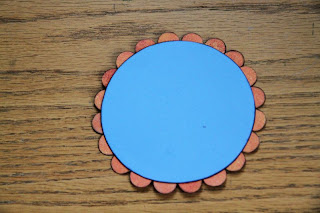
And from the front:

I repeated the process, but with bigger circles this time:


The square paper Liquid Candy is 9.5" x 9.5". This is what it looked like with the red scalloped border:

Using doubled-sided tape I adhered the square onto the yellow cardstock.

Following the curvy lines on the Tutti Frutti paper, I cut a strip and adhered it to the left side of the layout.
I added my blue circle in the left top corner.

I added my photo.

I also added a Sticker Element to put my journaling on.

I finished the layout with some doodling, the title (using the Sticker Alphabet) and some more stickers.